
This year has been a creative rut for me so far. I haven't done many shoots due to the lack of inspiration and most of the shoots I have done were client work. However, I found an artist that has really sparked some inspiration. The artist is a Canadian painter named Christopher Pratt.
I have no idea how I first heard of the name Christopher Pratt (maybe Guardians of the Galaxy? Just kidding), but I remember seeing some of his works back in December of last year. I immediately thought "wow this guy's work is right up my alley" and bought a 15 dollar monograph of his work. However, I only recently sat down and studied it more thoroughly. Afterwards I felt so inspired that I needed to write this blog post and note down my thoughts.
If you follow my work and other blog posts, you'll know that I love visually aesthetic things. However, many of Pratt's work isn't that aesthetic from a visual sense. Instead, Pratt's work resonates with me at an emotional level. What I find impressive about Pratt's work is the clear mood and emotion invoked by the simplistic compositions. Although the composition is simple, the amount of detail and the level of precision in his pieces is astonishing. It's even more unbelievable when I learned that Pratt's paintings are drawn from memory and are not meant to represent reality.
There's so much to talk about in these simple compositions, but I'll try my best to keep it organized. We'll look into some paintings I like and discuss the objective characteristics of the painting followed by how the emotional impact is achieved. These are all my own musings, please let me know if you have any other thoughts on these paintings!
Disclaimer: Pictures used in this book are either from online or photos I've taken from the Christopher Pratt monograph that I own. I'm just using these for educational purposes, please let me know if there's any copyright infringement!
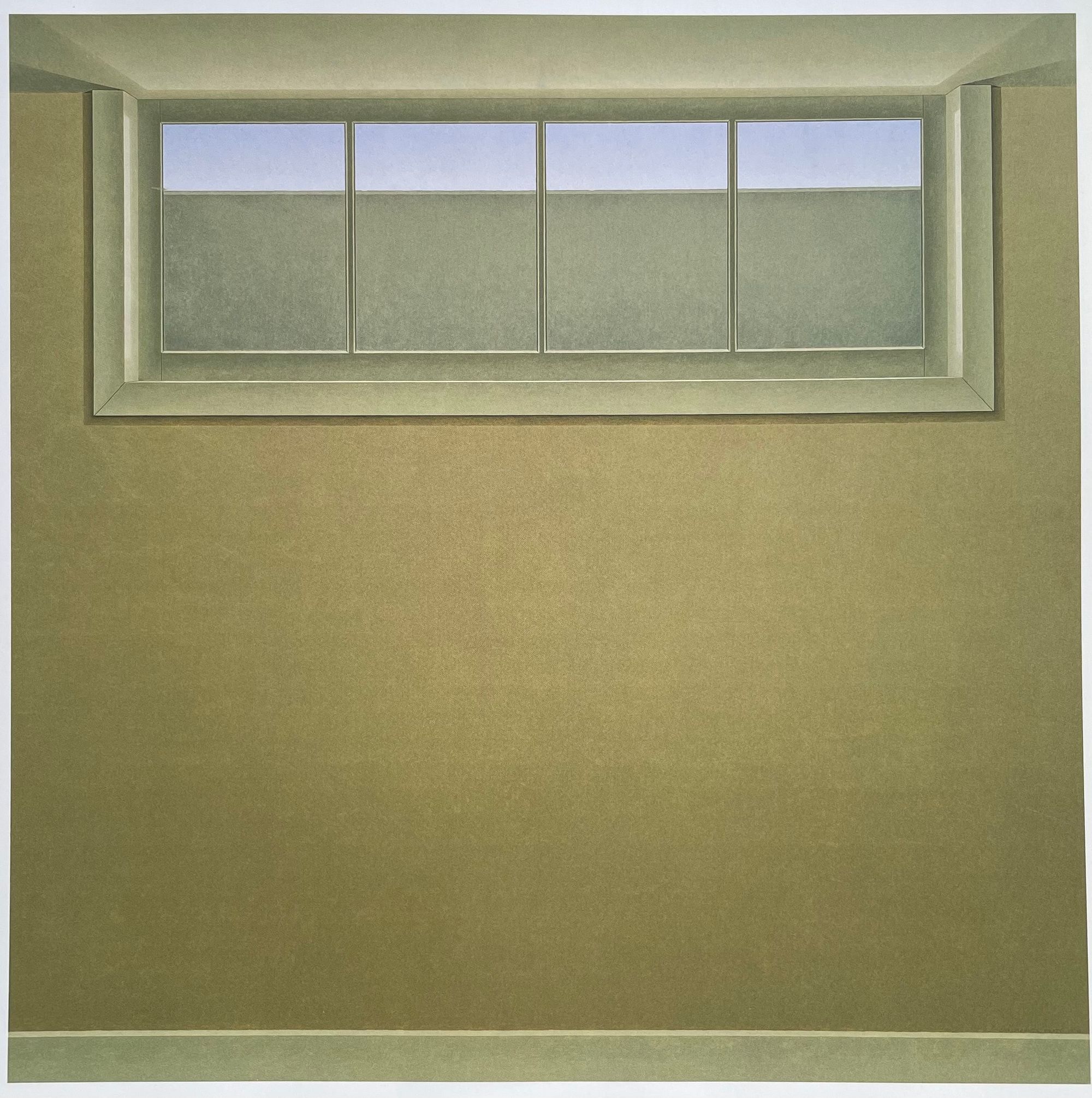
A common motif in Pratt's paintings is windows and interiors. In Basement Flat, the tight perspective of the interior is devoid of any furniture. The wall is painted uniformly with this pale yellow color, which I frankly find unappealing and old-looking. Near the top of the frame, there's a window that seems to offer an escape from this basement, but even the window's view is mostly blocked off by concrete. The composition is exceptionally simple, yet it triggers a strong emotional response - I feel isolated, entrapped, claustrophobic, and a little creeped out. That's what I love about this painting - so much is achieved with so few elements.
The colour gradient choice and geometric compositions remind me of colour field painters such as Mark Rothko. Rothko was known for stripping away almost all elements in his composition and delivering emotional impact with only blocks of colour. It's always interesting seeing traces of other artists in each other's work.
Pratt did many similar window interior paintings throughout his life, and many of them give off similar feelings. One might wonder - what made Pratt paint such bleak and eerie pieces? Long story short, Pratt is a Newfoundland patriot and these paintings express his feeling of Newfoundland's abandonment and mistreatment by the federal government of Canada. Canada promised to improve the quality of life for Newfoundlanders when Newfoundland joined the confederation, but those promises never got met. Shop with empty shelves overlooking the ocean, room with a bare bed overlooking the ocean - these eerie paintings express Pratt's feeling of abandonment, isolation, and entrapment after joining the confederation.
Normally, these rooms would have a feeling of home, but with all the furniture gone and the room stripped of personality and humanity, it suddenly feels alien and lifeless. The scene feels familiar yet unfamiliar. By breaking our expectations and assumptions, Pratt is able to deliver a strong emotional response.
Although my situation is different than Pratt's, I think these window paintings resonated particularly strongly due to being stuck at home in the pandemic. The entire year just felt like looking out a window and unable to go out. I feel incredibly isolated and entrapped. It almost feels like my house is a fancy prison cell.
Another interesting note worth mentioning is that Pratt's interiors reminded of the photographer Todd Hido's interiors, which also trigger similar emotional response. Just like Pratt, Hido's interiors are also empty, devoid of furniture. Hido even uses a similar muted palette. Interestingly, two different artists of two different mediums had very similar concepts.
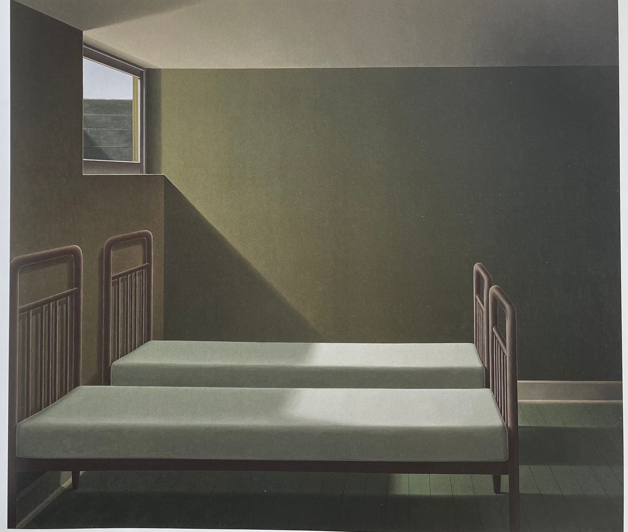
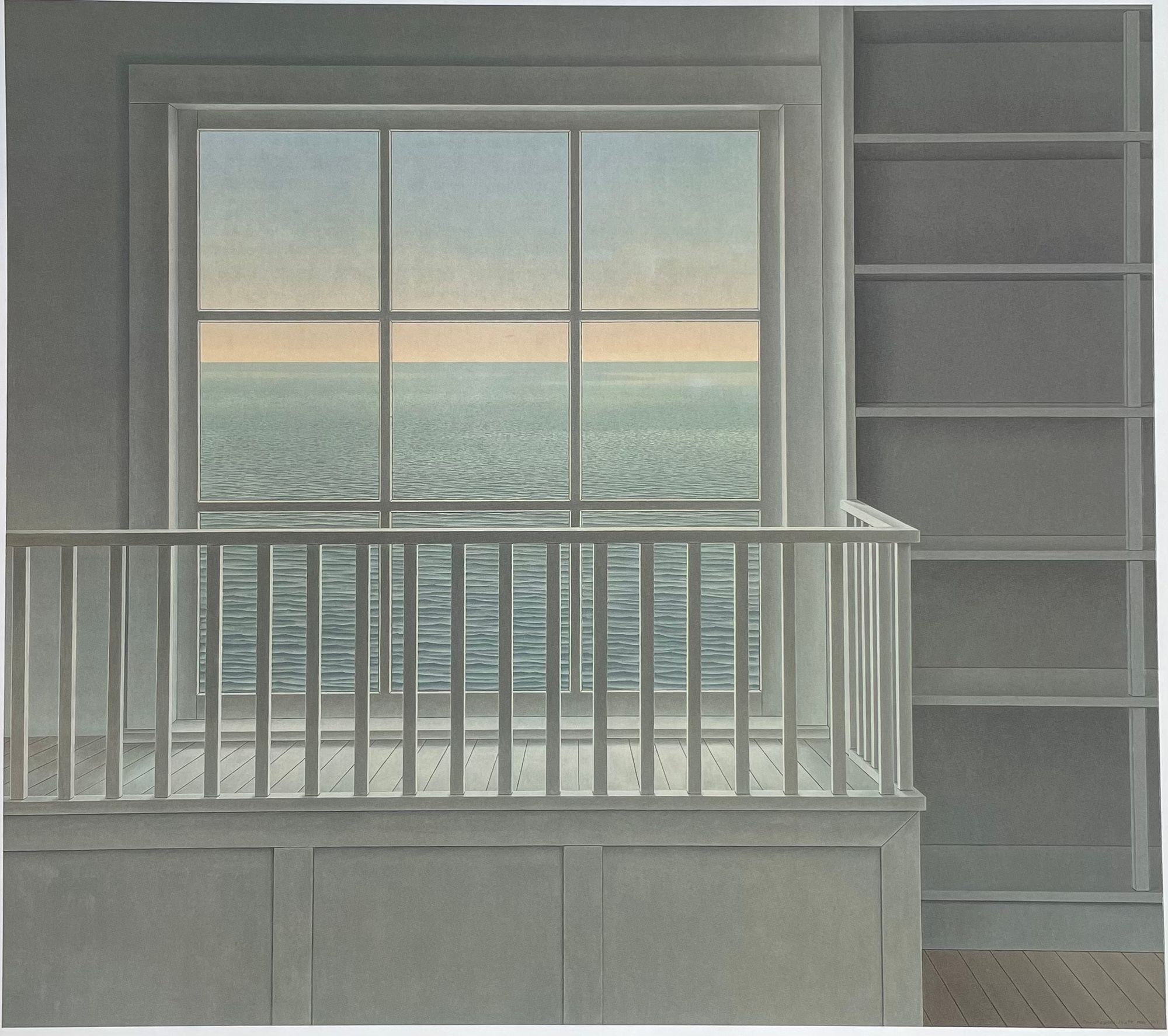
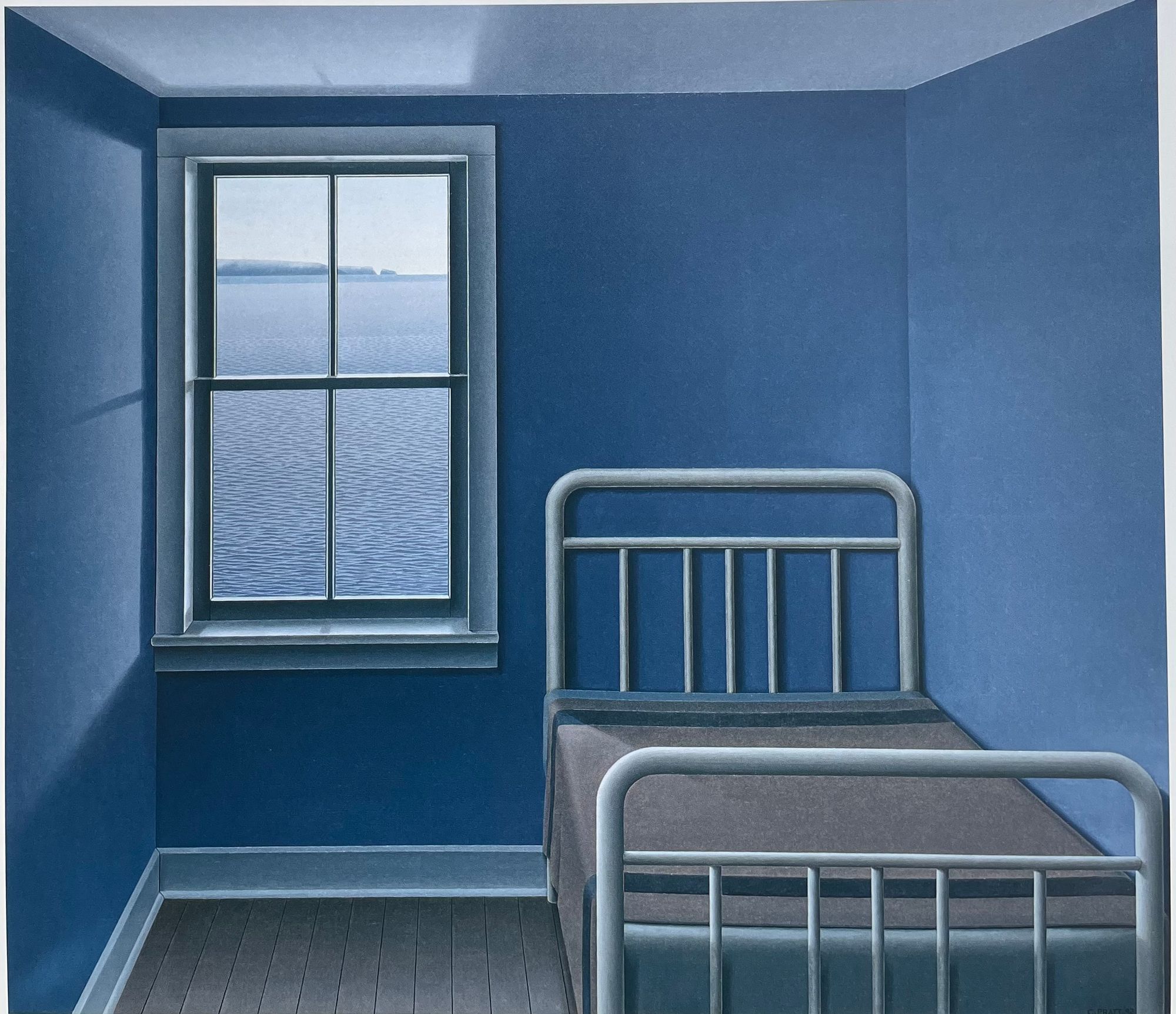
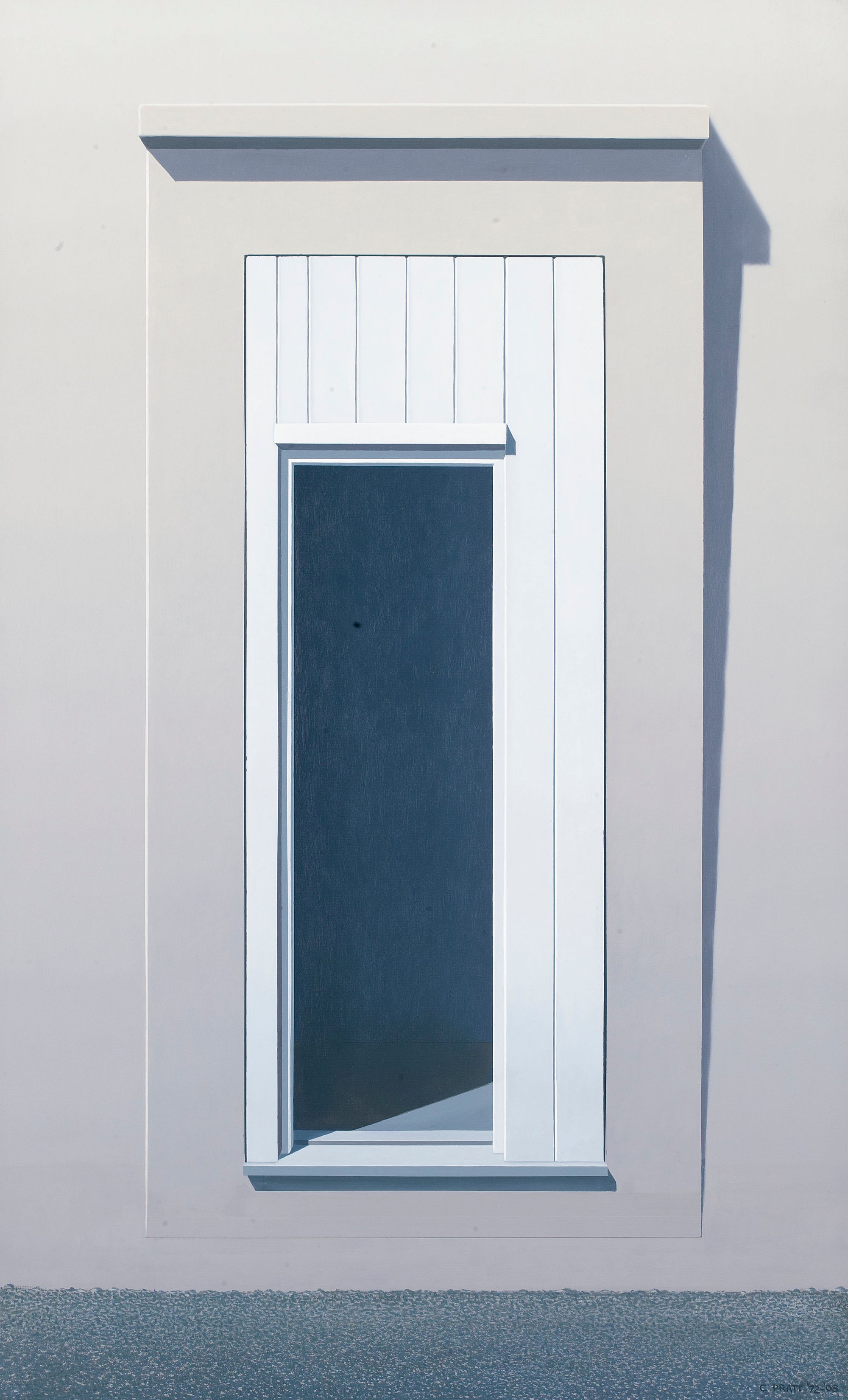
Let's dive deeper into one of my favourites of the window series - Basement with Two Beds. Looking at previous paintings, it's clear that Pratt's work has aspects of simplicity and geometry. But what stands out to me the most is Pratt's precise control and deep understanding of lighting. In this painting, there's one main source of light, which is the window. With this single light source, let's look at the complex shadows Pratt has painstakingly drawn in:
- The shadow created by the window ledge starts with sharp lines but fades blurrier as the light travels. The window ledge also has a subtle rim light.
- The shape of the window frame shadow on the bed is consistent with the angle of the light source and the height of the bed.
- There's a consistent shadow gradient on the wall, darkening in parts of the wall that's farther away from the window.
- The bed shadow and the ledge shadow on the ground are layered, with the bed shadow being darker of the two.
- The bed legs near the left wall create a shadow towards the left side whereas the right legs create a shadow towards the right side.
The composition is so simple, but the level is detailed in lighting is almost photographic. Pratt does this for all his pieces and I can't imagine how tediously long it takes. It's this realism in lighting contrasting the surrealism of the spotless interior and furniture that accentuate the feeling of eeriness.
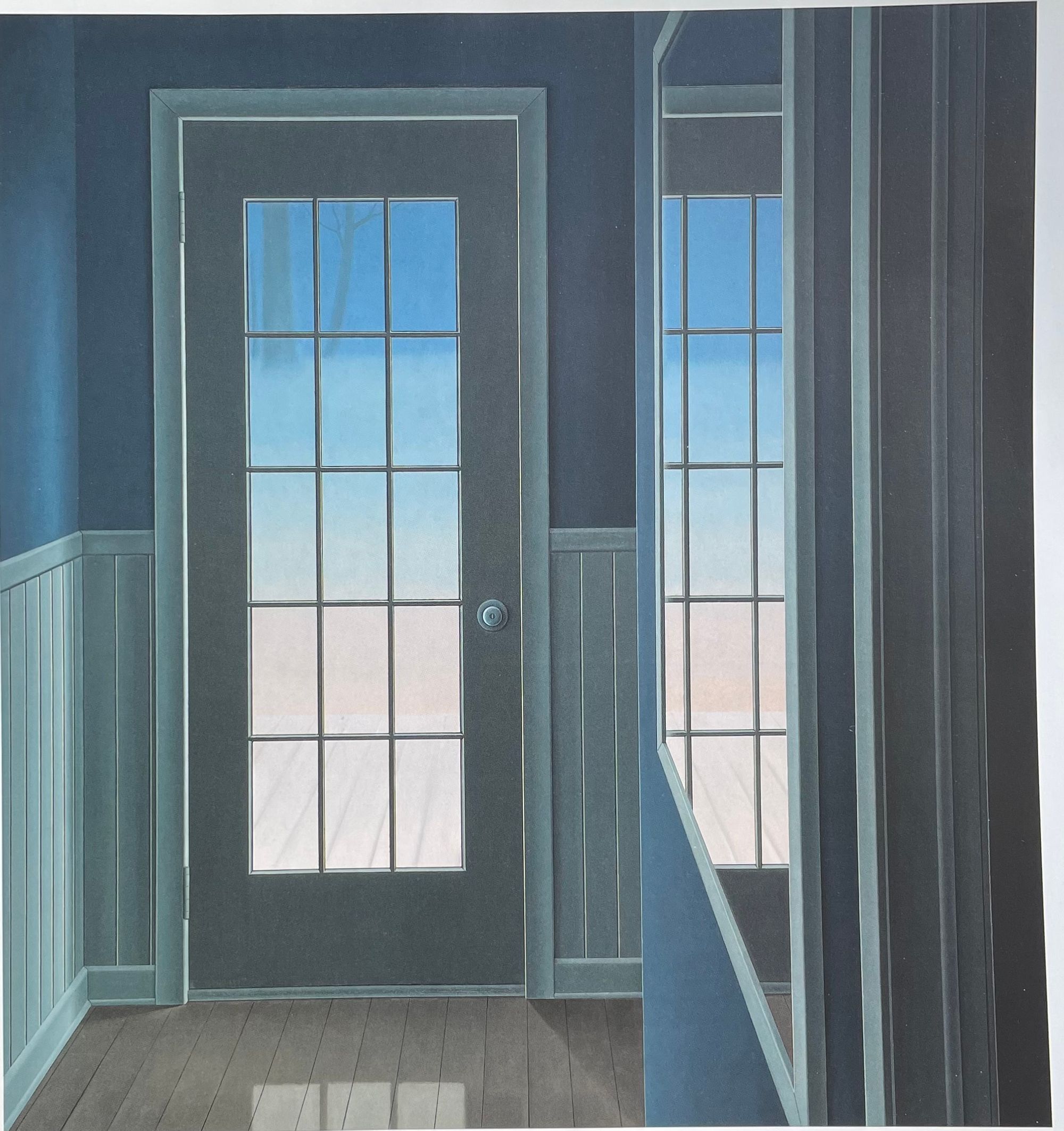
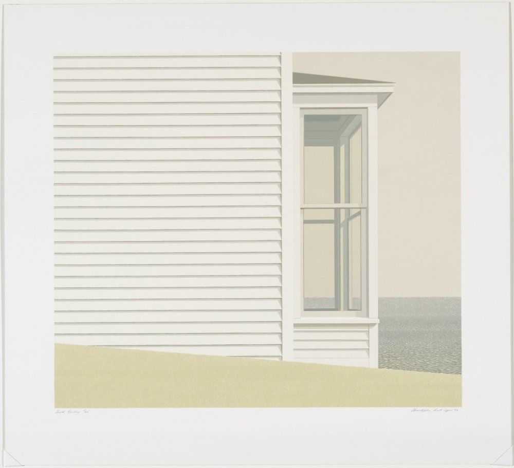
This is another one of my favourites from the window series. Although Pratt did many window paintings, they don't all invoke the same emotion. This one feels more peaceful and less uncomfortable to look at, although still exuding some feeling of eeriness and isolation. However, just like all the other paintings, this one exhibits the same amount of discipline and detail in portraying lighting.
I find this particular composition to be interesting due to the way it draws the attention of the viewer. The outer layer consists of the natural world, featuring free-form textures, spottier colors, and two lines separating the ground, ocean, and sky. The middle layer consists of the building wall which features hard shadows and repeating horizontal lines as the texture of the wall. Finally, the center layer includes the window and its interior where there's complex geometry and complex shadow. It evident that the elements of each layer become more complex as we move towards the center. As such, the viewer experiences a gradual feeling of entrapment and longing to be outside as the composition transitions from openness to confinement.
I noticed this painting (and many others) remind me of Edward Hopper's work. It's similar in subject, color palette, and mood. The key difference is that Hopper's paintings usually have some human figures to accentuate loneliness and isolation. Pratt has mentioned himself that Hopper is a source of inspiration for him.
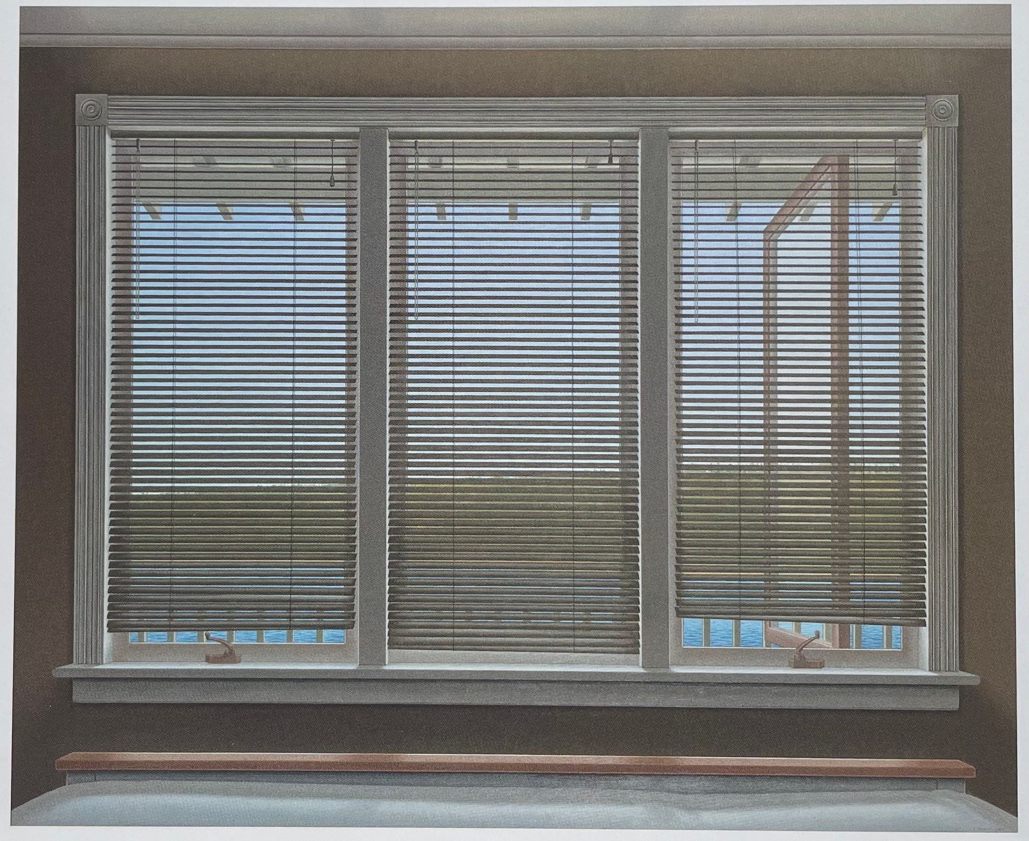
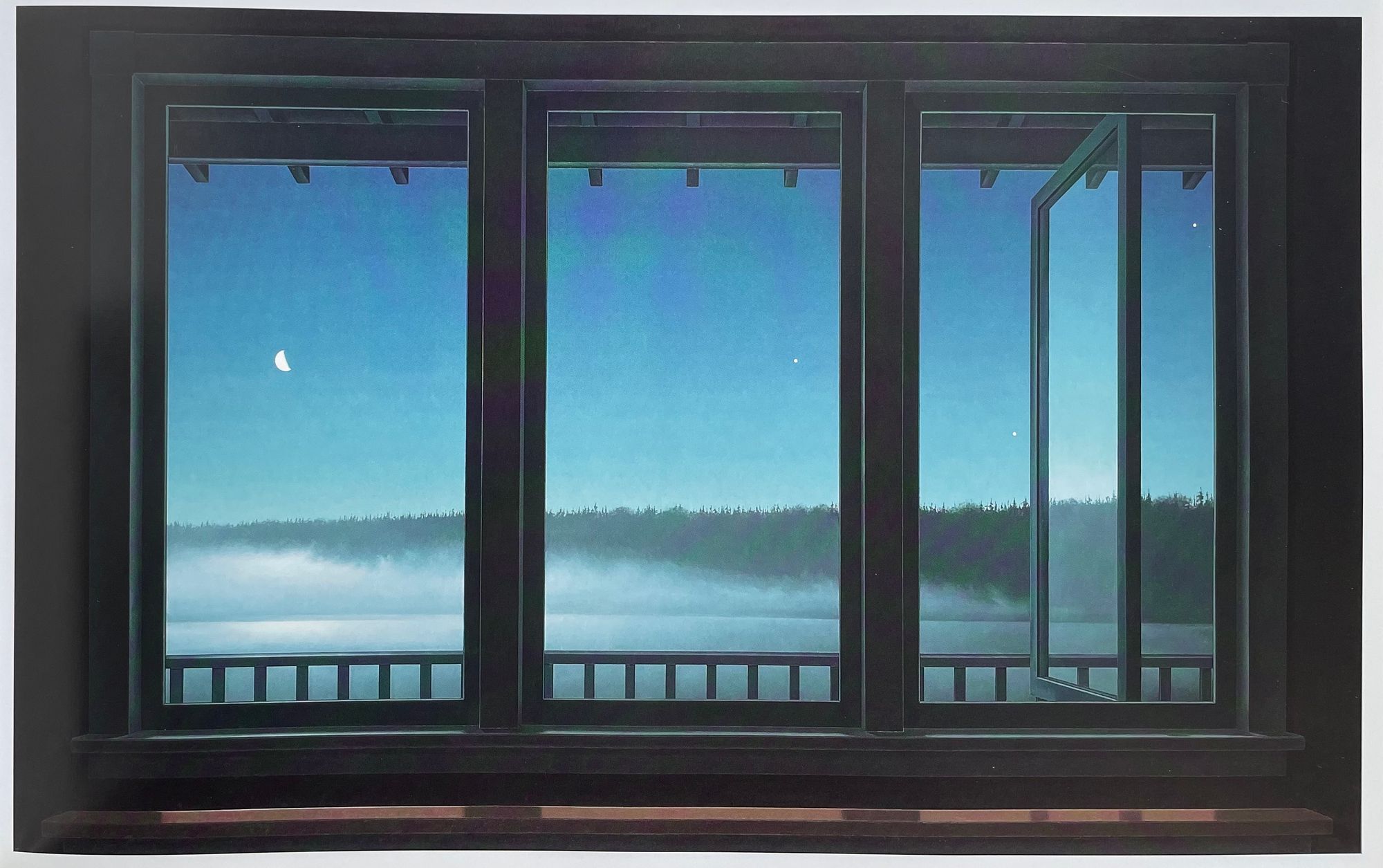
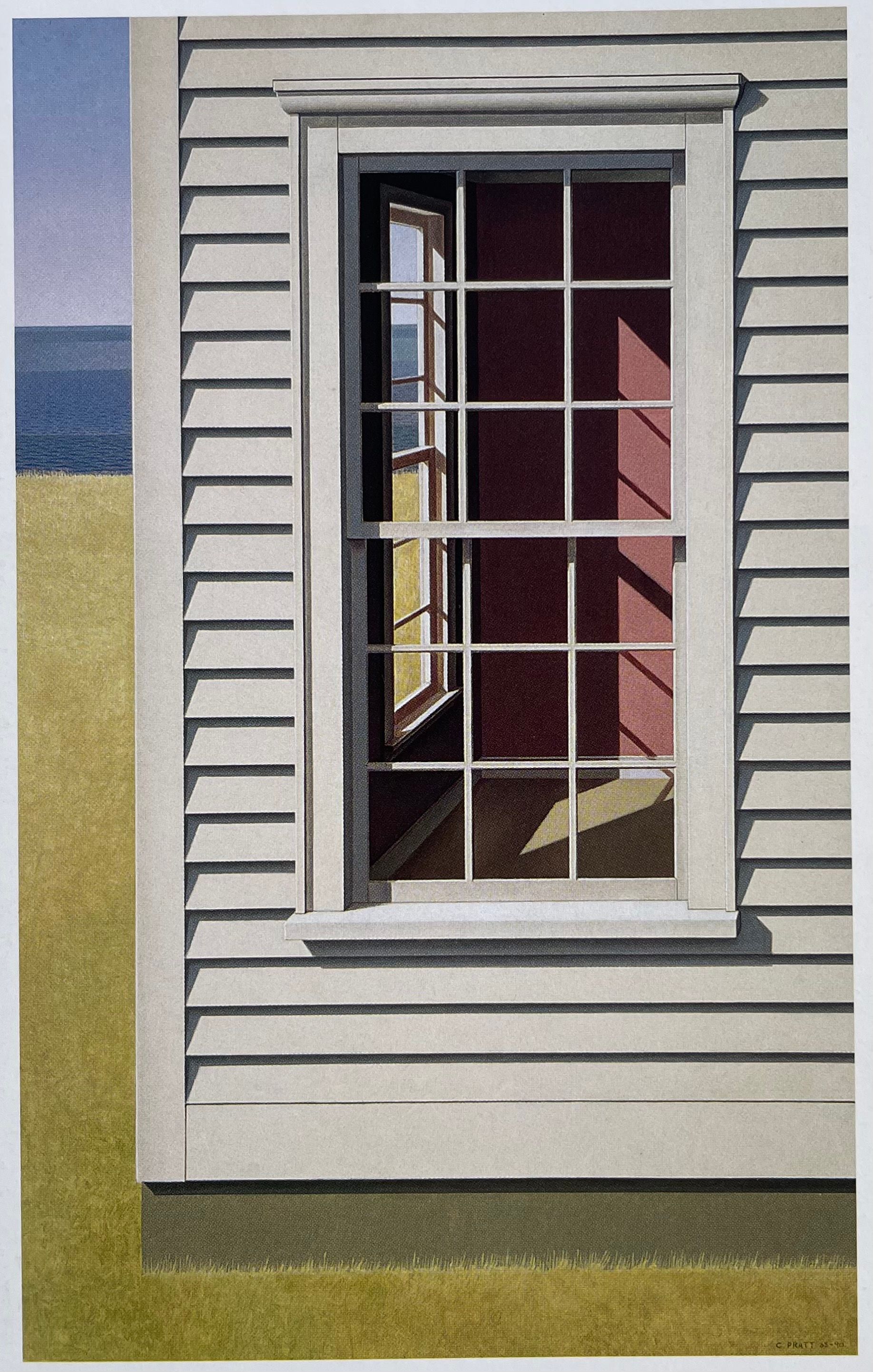
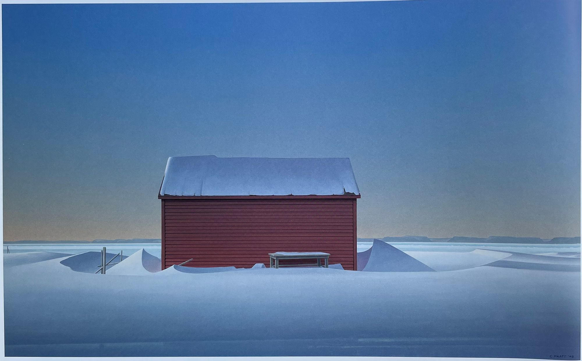
Pratt's windows and interiors aren't always about isolation and entrapment. It's crazy to me how many different ways Pratt draws windows and the array of moods that are conveyed through them. In the above two paintings, the composition is almost identical, yet they give off different moods - the left one has a relaxed summer feel and the right one has a cool mysterious feel. Unlike previous paintings of bare windows, we also see inclusions of other window elements such as blinds and reflections of an open window in these two.
The artist's disciplined attention to detail for these two paintings is impressive, especially the left one. Each slat of the blinds is drawn carefully to be perspectively consistent with the rest of the scene - we can see the bottom blinds are "thicker" since the perspective is looking down towards them. The background scene and window frame are also perfectly drawn between the slats. Lastly, we can tell there's a reflection on the open window even though it's blocked by the blinds. This entire composition just looks painstakingly tedious and time-consuming to paint. But without this realistic approach to detail, the feeling of the piece wouldn't be the same.
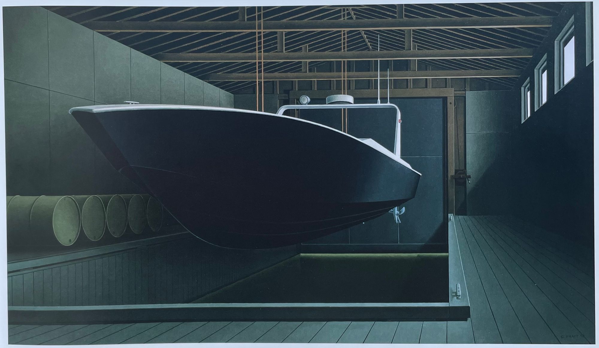
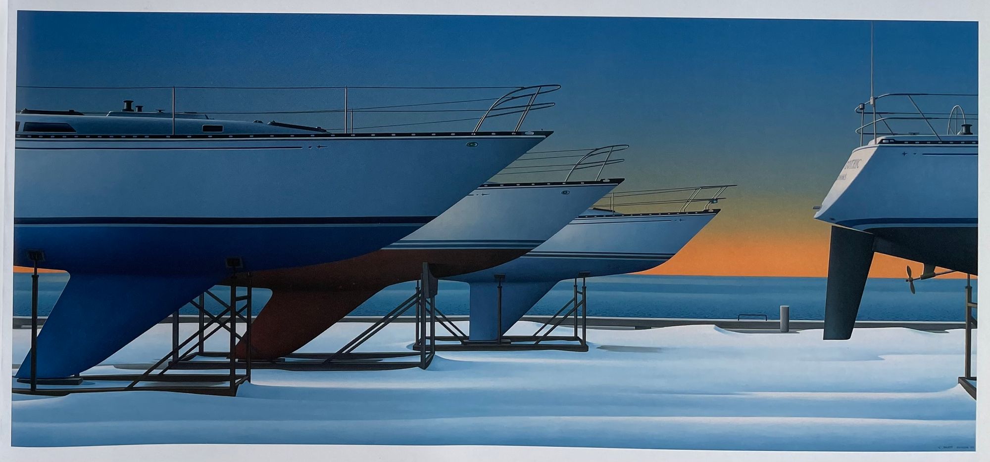
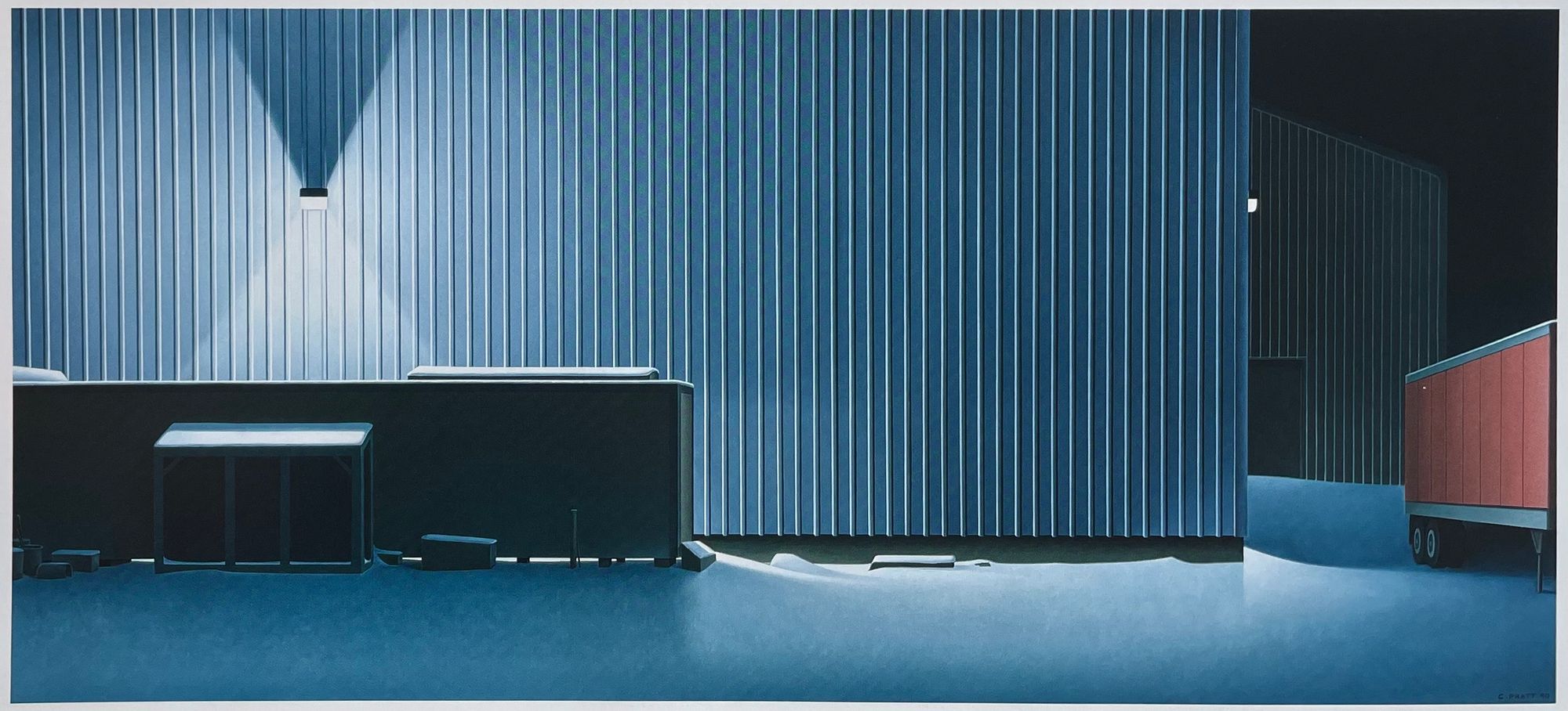
Another common subject across Pratt's work is boats. However, none of Pratt's boats are in the water, where its natural habit is. Instead, the boats are helplessly stranded, isolated, and vulnerable on land. These boats look like they're in storage with no humans to be seen, giving off a feeling of abandonment.
I especially like the left one. Just like the other paintings, this one exhibits incredible discipline towards detail. Although this painting also has interesting shadows and lighting gradients, I like the perspective more. The field of view is very wide, which causes the boat to look obnoxiously imposing. Everything in the composition is perspectively correct, with most of the painting featuring rectangular objects. But the boat takes on a more free-form shape, creating a nice contrast of shapes with the rest of the scene.
I'd also imagine the form makes the boat much more difficult to draw perspectively correct. The precision and correctness of Pratt's scenes really appeal to the engineering side of me. It was no surprise when I found out that Pratt was in pre-engineering before switching to art school. During his time in engineering, he worked as a surveyor doing technical and precision drawings which played a key role in his aesthetic.
There are some political interpretations here as Pratt is a Newfoundland nationalist and oversaw Newfoundland's transition into the confederation of Canada. The boats in these paintings often symbolize Newfoundland and the old way of life (such as fishing) being abandoned and uprooted. Pratt mentions for one of his early boat sketches "I did this print in 1961, at a time when things were changing very rapidly in Newfoundland. it seemed to me that traditional and viable social structures were being systematically discredited."
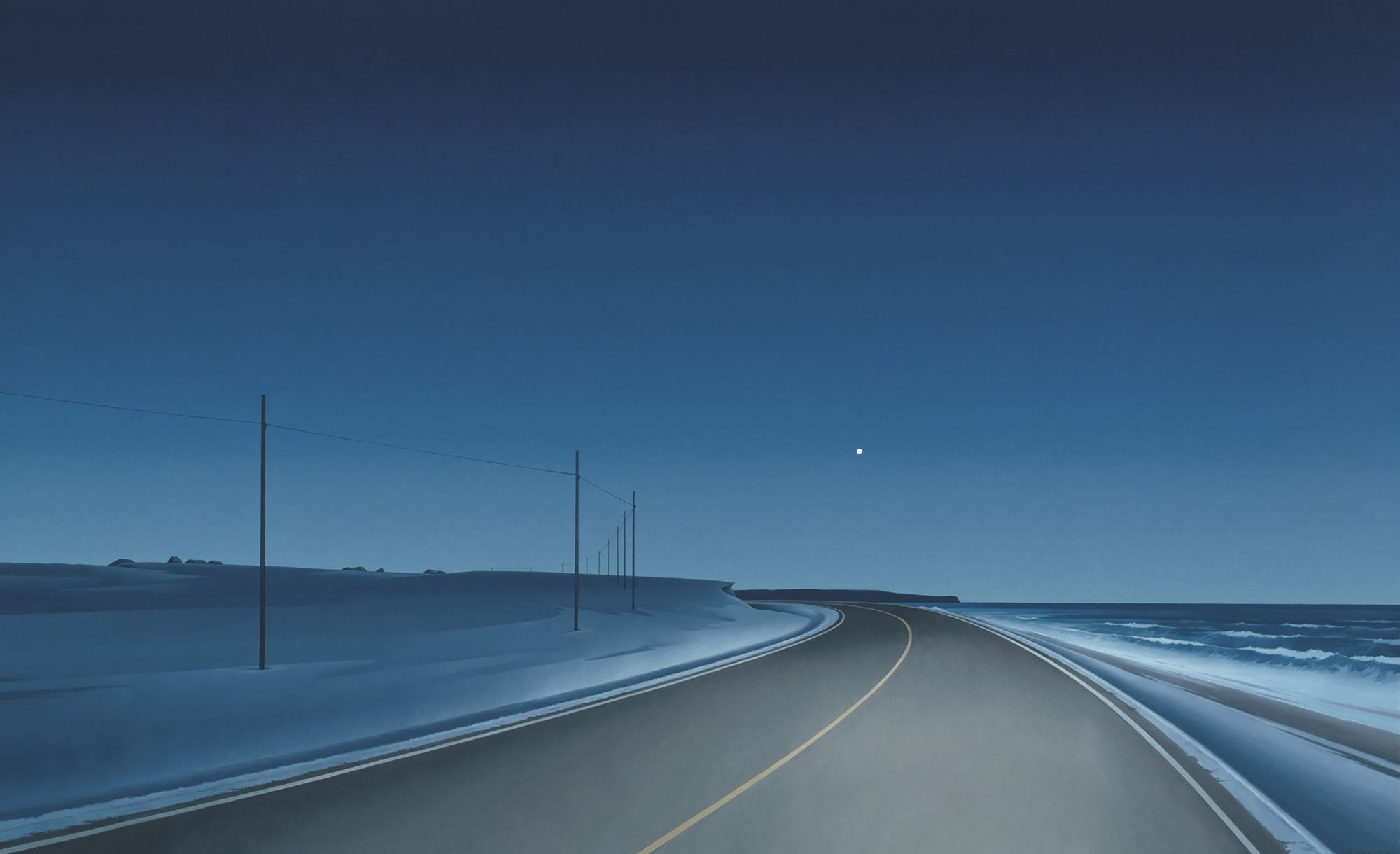
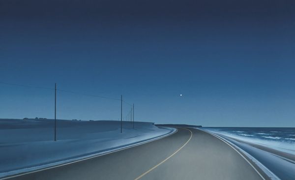
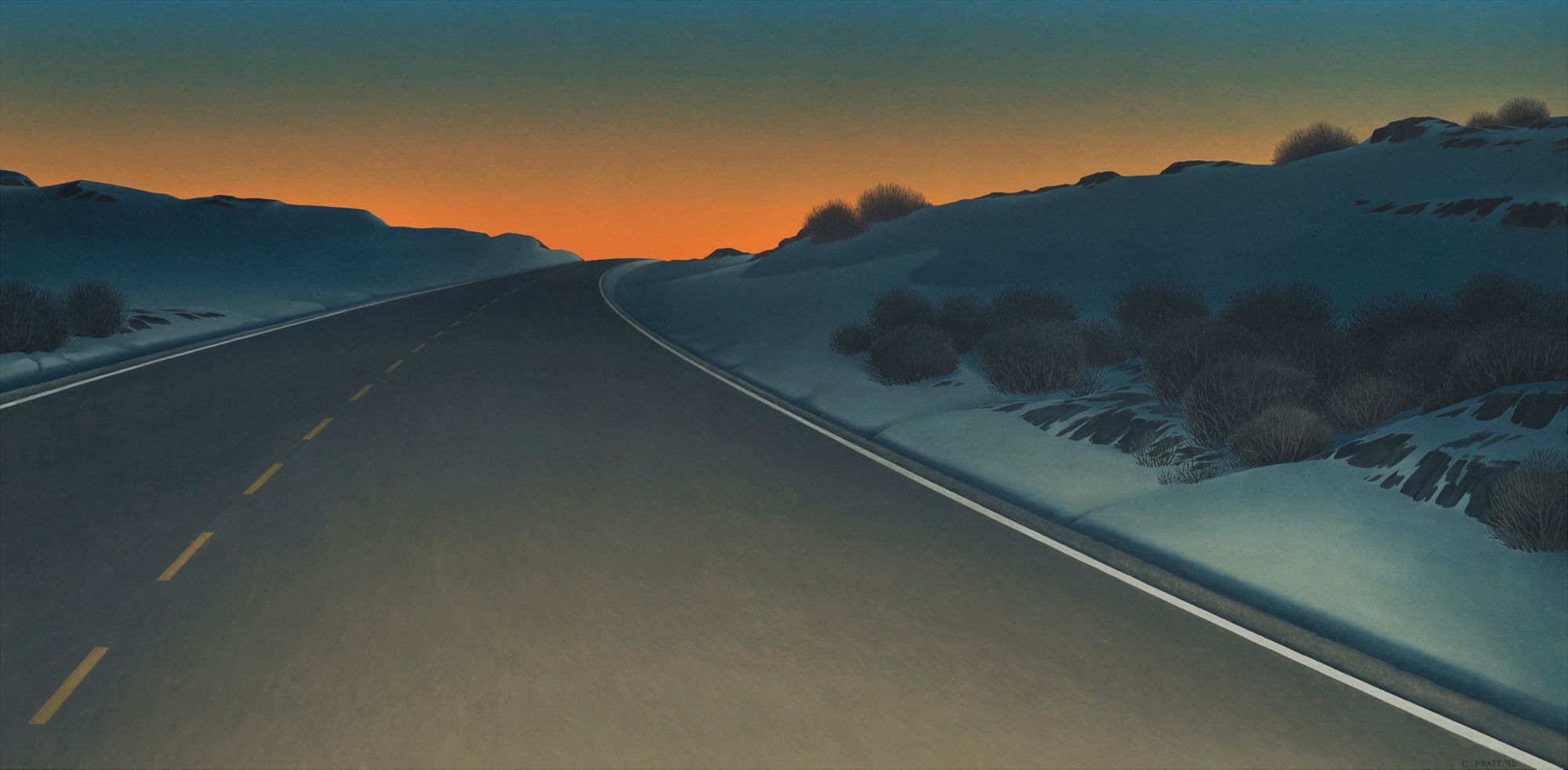
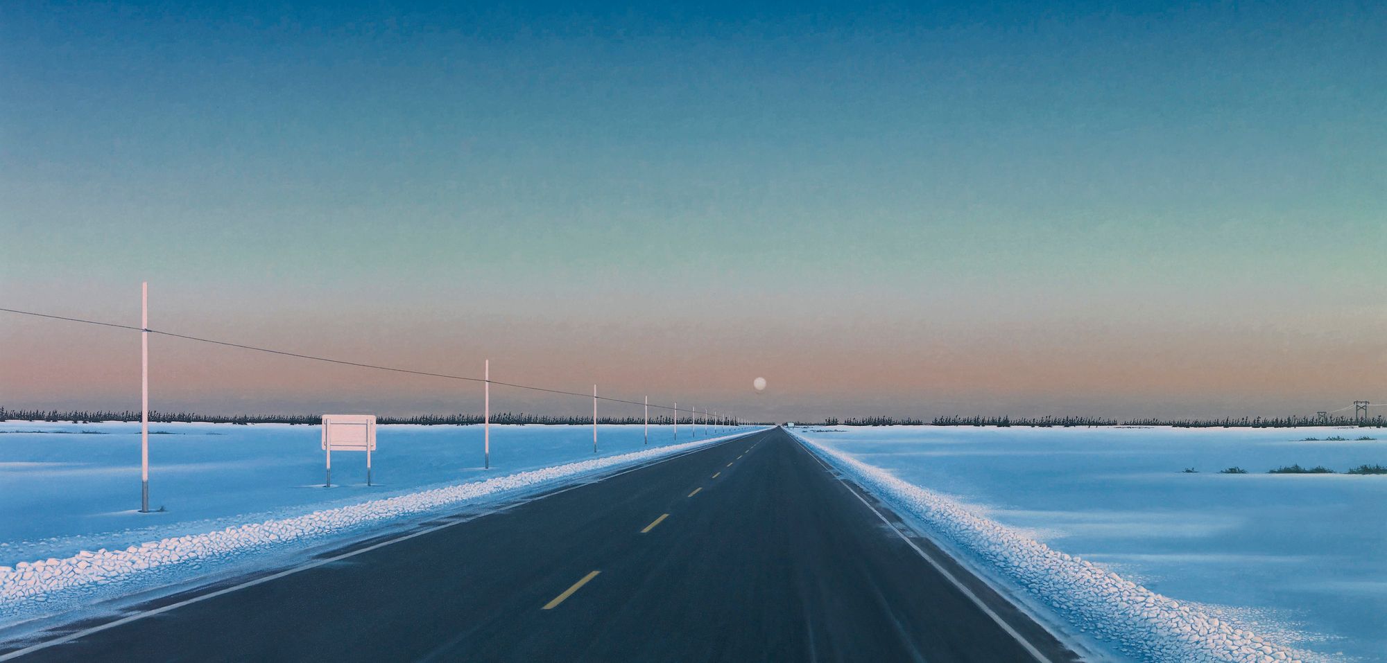
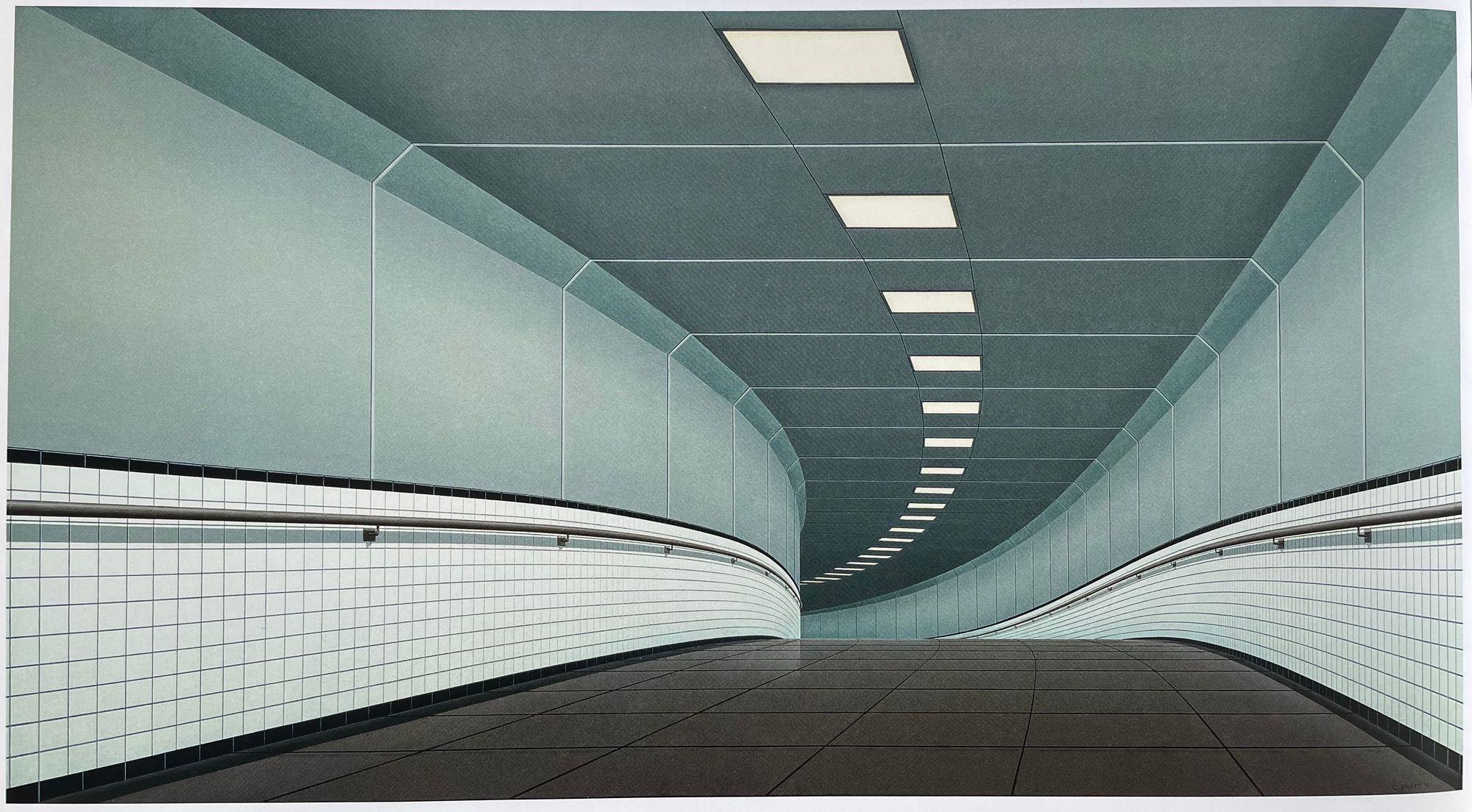
Lastly, let's talk about the Driving to Venus series of work that introduced me to Christopher Pratt. Pratt did many paintings around driving, but they all give off a feeling of peace, solitude, voyage, and continuity.
In this series of paintings, Pratt depicts the feeling of driving. The brightly lit foreground suggests the scene is painted in the perspective of a driver. Due to the association with driving, there's a natural feeling of movement in this painting. The road curves into the horizon and eventually disappears. With no obvious destination in sight and a seemingly infinitely long road, the painting is more about the peaceful and meditative driving experience itself.
When I first saw Driving to Venus: From Eddies Cove East, it immediately resonated with me and reminded me of the countless cross-country road trips I've done throughout my life. During these trips, the destination is far away and there's plenty of time. It wasn't about getting somewhere, it was more about being in the moment of driving. I was reminded of the quiet and cool nights driving through the empty mountainous roads, with only my headlights and the moonlight to guide me. The road felt endless, as I knew there were thousands of kilometers to go. With my friends asleep and no one to talk to, my mind wanders off into random thoughts. I felt present and the driving felt meditative.
In a time with heightened anxiety and unrest, these driving painting brings me inspiration. It was a hit of nostalgia and I wished to experience these road trips again. I feel more motivated to plan a trip and make it happen.
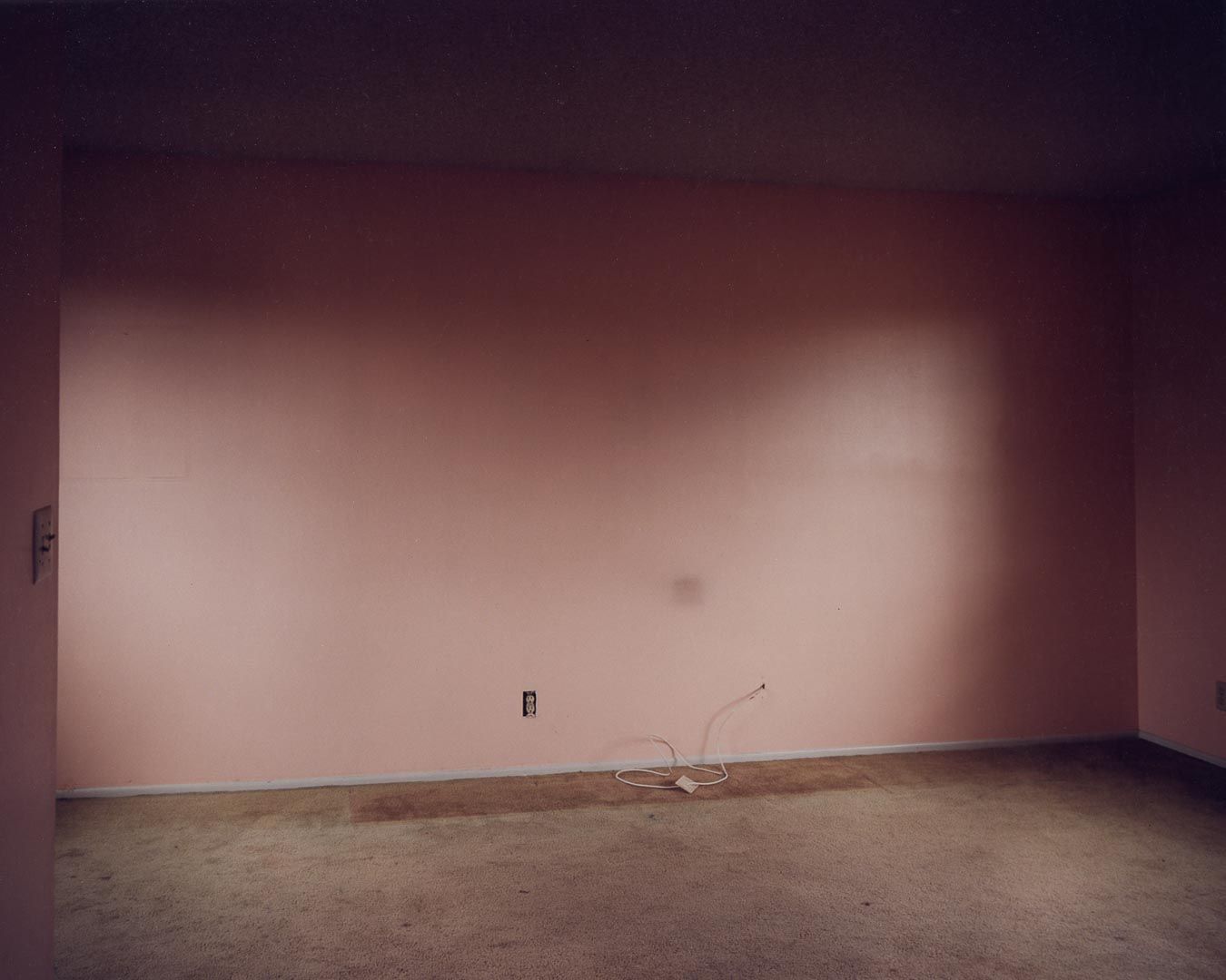
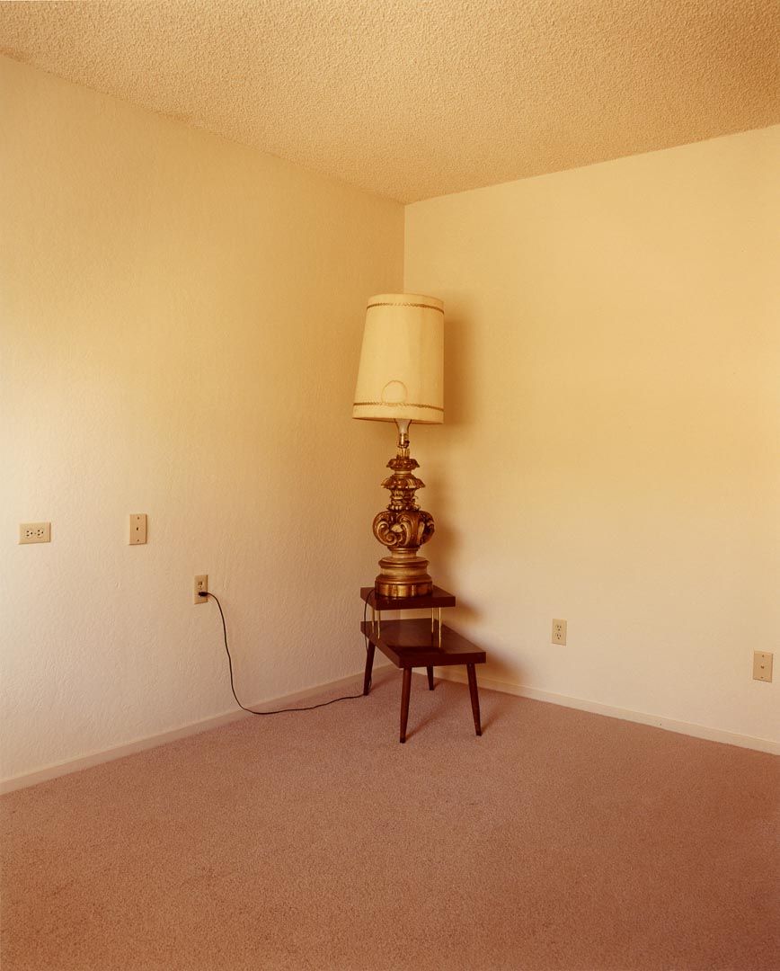
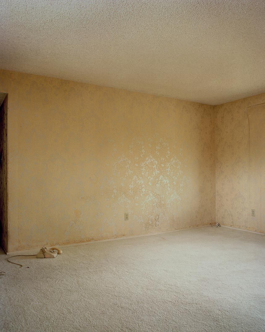
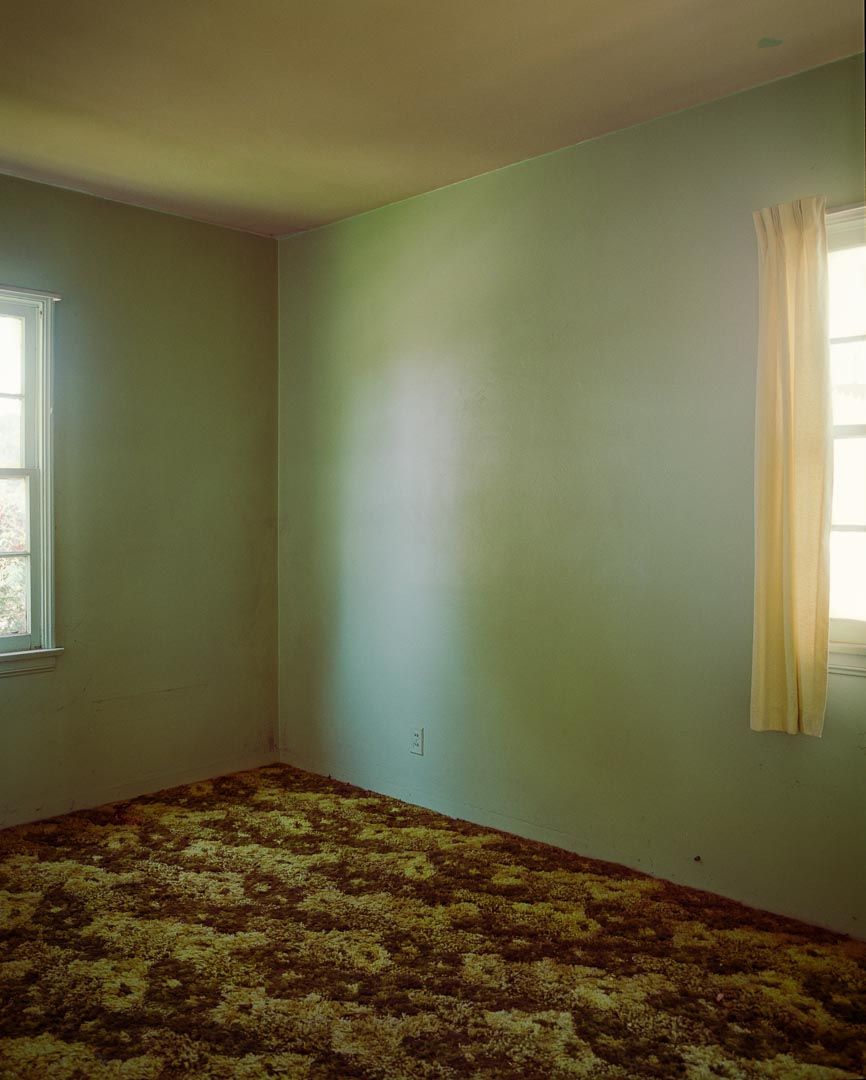
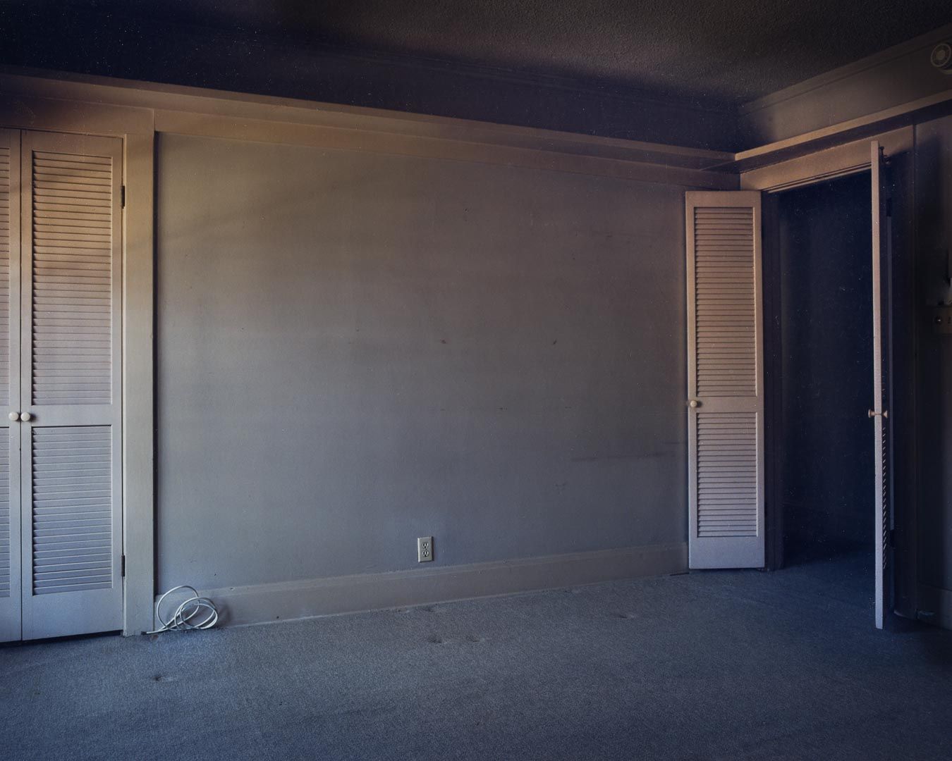
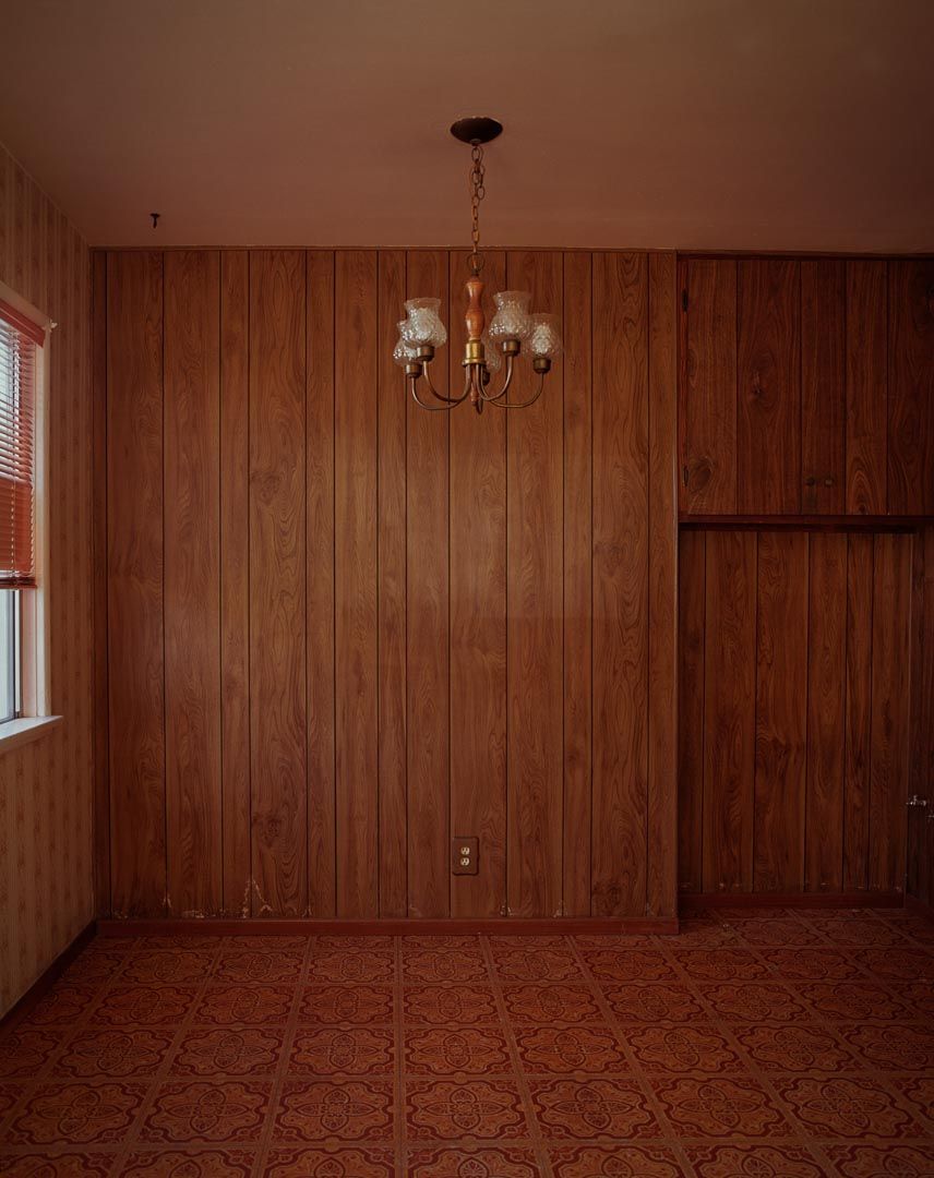
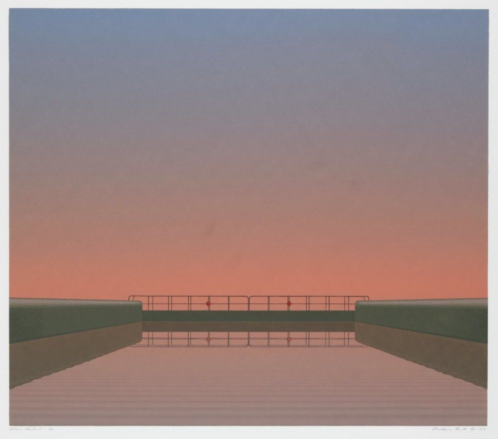
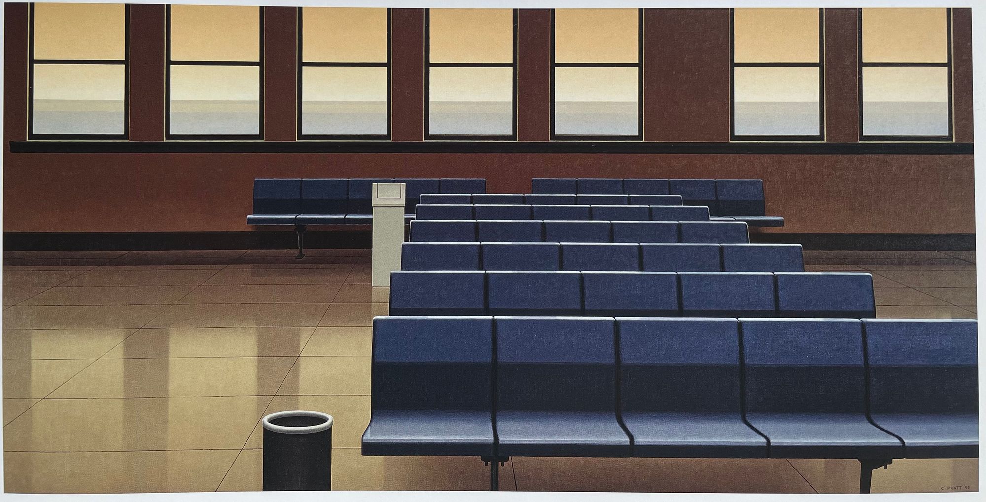
There are a lot of other paintings from Pratt that I like, but that would just turn into an endless discussion. Since Pratt's paintings are hard to find, I've attached some more that I like. I hope you learned something and enjoy these paintings!
