
Michael Kenna is no doubt a contemporary master at photography. I've been a long time fan of Michael Kenna and spent time analyzing his composition and post-processing techniques. In this post, I'll be dissecting Kenna's photos, explaining why his I think his photos work, how it's done, and finally, show some of my attempts at incorporating his aesthetics into my photography.
Kenna's compositions are minimalistic by nature with very clear subjects. The way he achieves this is by framing the photo to include limited number elements and using clear and obvious compositional techniques. Lastly, Kenna aggressively applies post-processing to reduce the rest of the clutter and unnecessary elements of the photo. As a result, Kenna's photos demonstrate intense focus and minimalism, which produces a peaceful and zen feeling.
Even if minimalistic pictures are not your desired style, I think there's still a lot one could learn from Michael Kenna. Through his photos and editing techniques, we can learn how to bring more focus to the main subjects and remove useless clutter in our own photos.
Compositional Techniques
In the next few sections, we'll explore some of the compositional techniques Kenna uses to achieve his minimalistic look.
Lines
Lines are fundamental composition elements used in all forms of visual art. In many cases, it's used to bring focus and create a movement to the main subject. However, in Kenna's pieces, the lines are the subject and the focus. He has many pieces where the entire photo simply showcases an elegant line. Other times, there are a handful of lines that juxtapose each other resulting contrast or complement each other.
Shapes
The combination of lines forms geometric shapes. More commonly, shapes are often implied in the composition to bring focus or to frame other subjects. In comparison, similar to how Kenna uses lines, shapes in Kenna's compositions are often the center of the piece. His pieces feature distinguishable shapes with strong identifiable outlines.
Rhythm
Just like rhythm is important in music, rhythm is equally important in visual arts. Rhythm, in short, is some form of repetition and order. To learn more about rhythm, this page has a concise and digestible explanation. In the case of Michael Kenna, he uses lines, shapes, and tones to create a rhythm for his pieces. This will be more evident in the examples.
Contrast
There are many forms of contrast in visual arts such as tonal contrast, color contrast, textural contrast, etc. Michael Kenna operates in monochrome and is a master at tonal contrast. For a large majority of Kenna's photos, the tonal range of the entire photo lies on the two extremes. Consequently, there actually isn't much contrast in texture. As a matter of fact, Kenna often intentionally removes much of texture of the elements in the photo but maintains a clear outline of the elements.
There's another form of contrast that's more accurately termed as juxtaposition, which is the contrast created by the placement of two objects. Kenna also employs this type of contrast in many of his photos, often in the form of lines, shape, and object association juxtaposition.
Examples
In this section, we'll dissect some photos by Kenna to analyze the composition and discuss why the photo works and how Kenna created it.
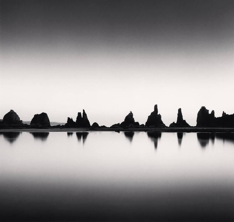
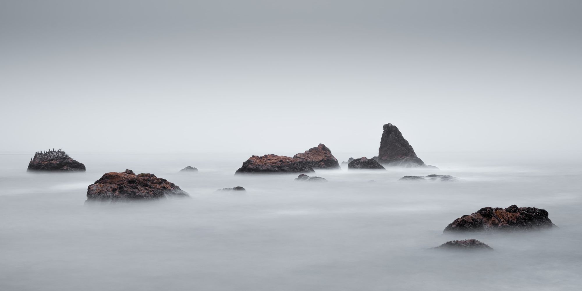
Rhythm: Rhythm occurs twice here in this piece. First, there is rhythm in the shape of the rocks - it alternates from tall to short. To complement, Kenna added rhythm in contrast through post-processing. We can see the tones alternate from dark to light to dark from top to down.
Contrast: Kenna processes his photos to the extremes of the tonal range. Here, we see that most of the subject is in the black and there's almost no detail in the rocks. The water and the sky are both darkened further to accentuate the rhythmic contrast.
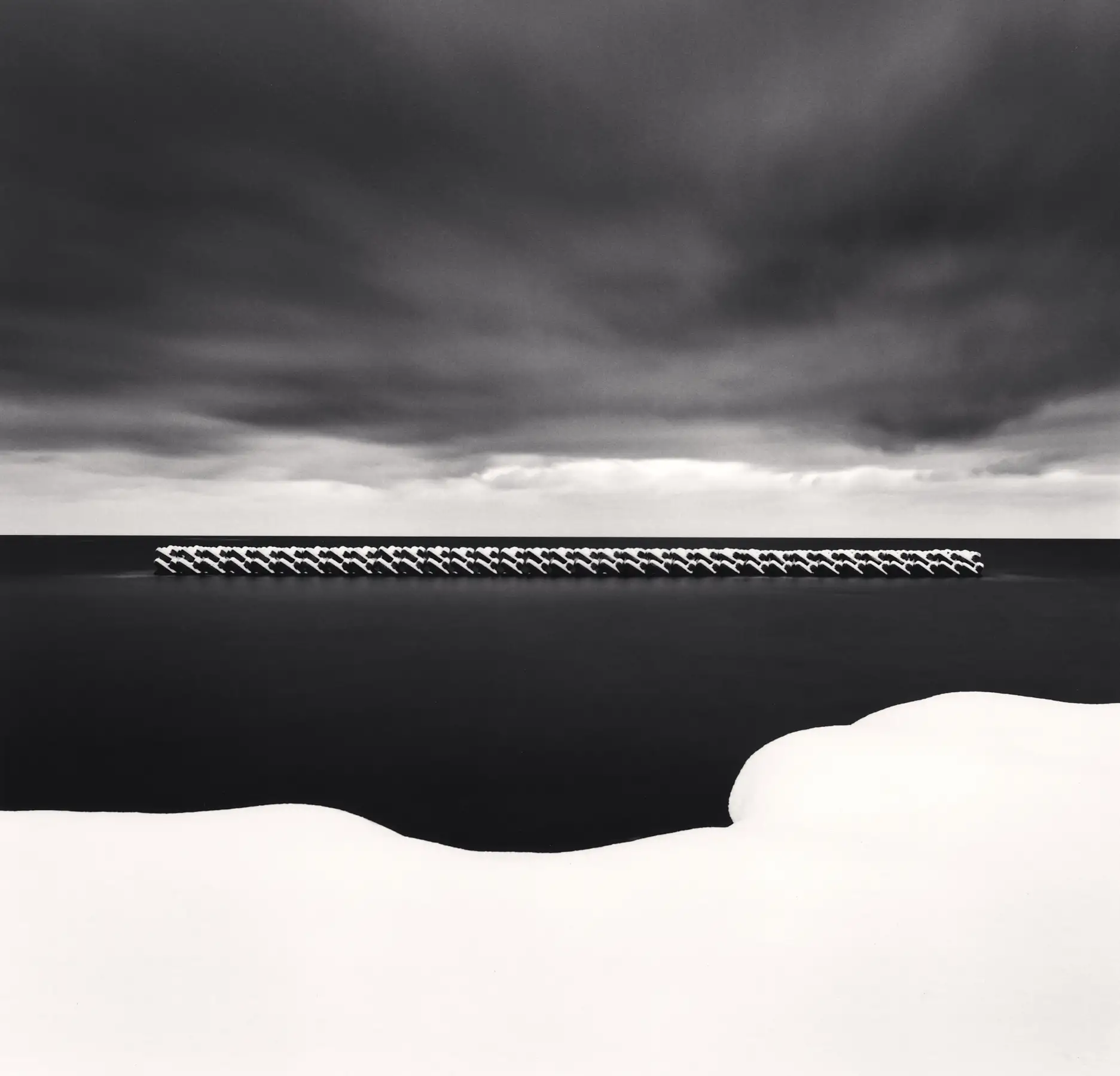
Rhythm: Similar to the previous photo, this one also has rhythm in contrast, alternating between relative light and dark. Additionally, there's strong repetition in the sea structure.
Contrast: What I love really about this photo is the contrast. The tonal range of the main visual interests is processed such that they're at the two extremes with minimal detail. In comparison, the dramatic clouds contrast the rest of the photo with its inconsistent middle grey tone. The clouds creates additional juxtaposition of texture as they are the only elements in the photo that exhibit texture. There's also the juxtaposition of the curved freeform land against the ordered and rigid sea structure. Together, this photo exhibits incredible balance and produces a feeling serenity and peace.
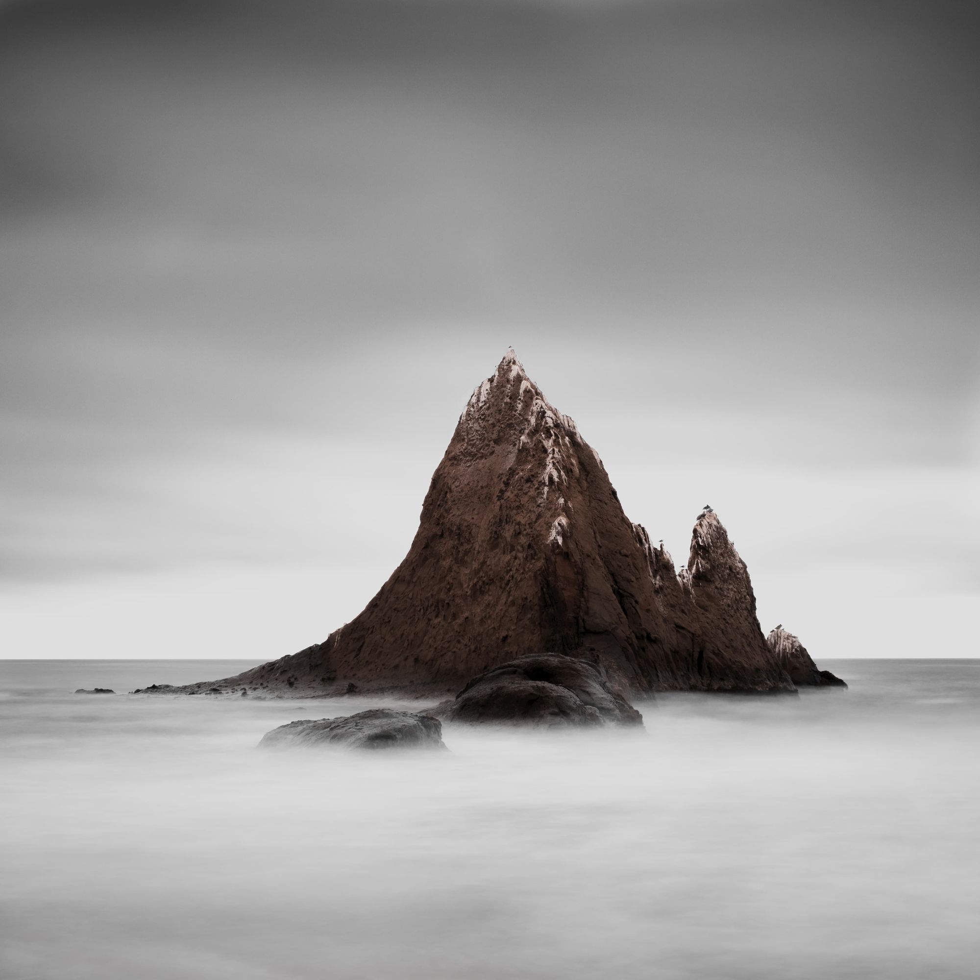
Rhythm: Similar to the ones above, there is a rhythm in this piece in the form of contrast. The tones alternate between light and dark throughout the entire photo. This type of rhythm is a recurring theme with Kenna's photo and can be seen consistently in his works.
Shapes: I love the usage of shapes in this photo. The bottom half of the photo consists of triangular shapes, processed such that there are details and contrast within the shape. Circular and oval-like shapes dominate the top half of the photo. As a result, the smooth textureless circular shapes juxtapose perfectly with the rigid and textured triangular shapes, creating a feeling of balance.
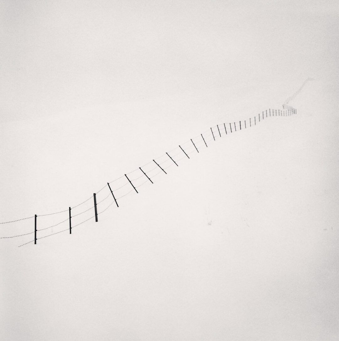
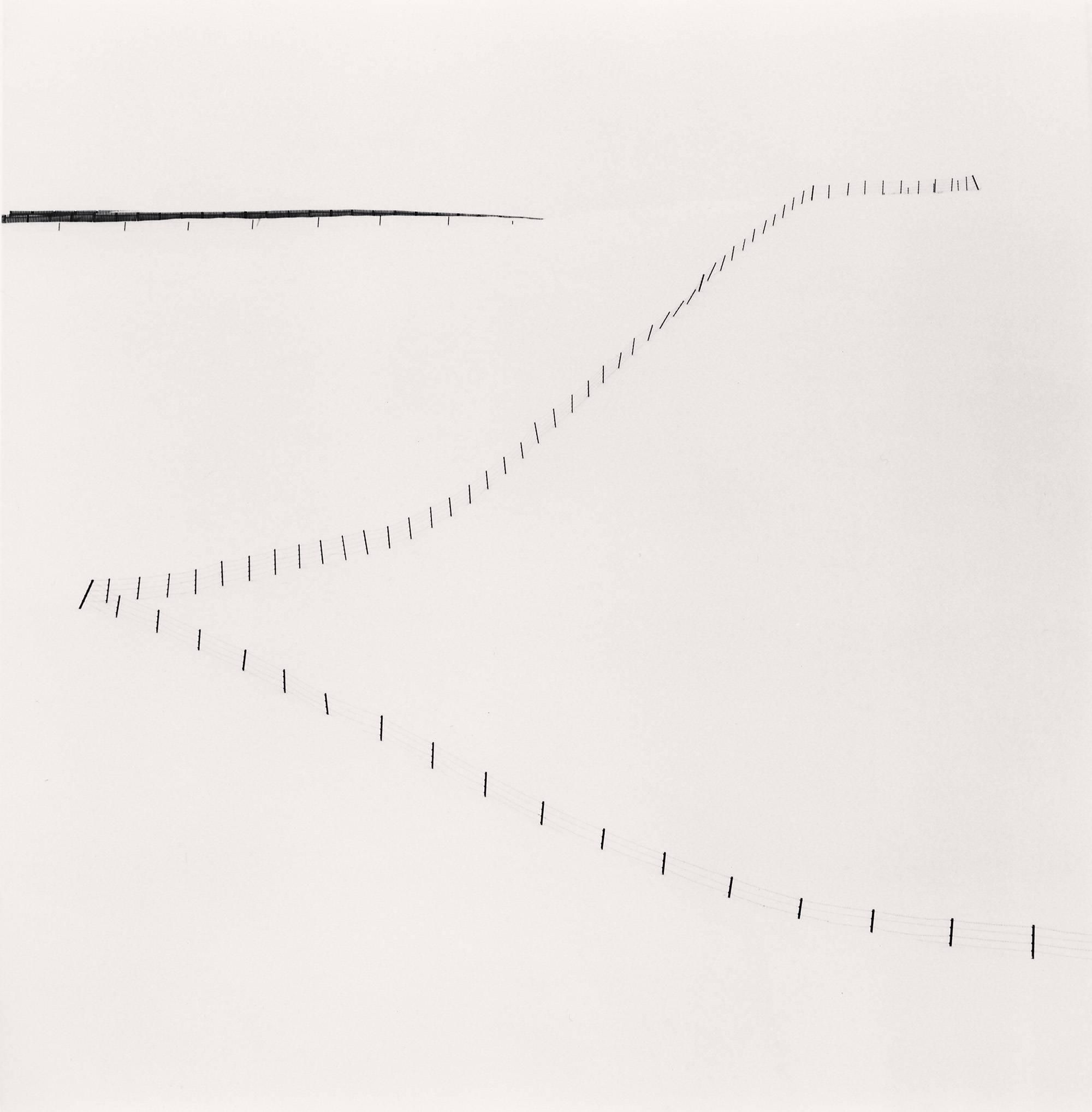
Lines: Kenna did an entire study series on these hillside fences, all of them with the strong lines formed by the fences as the main subjects. The sky and the snow are processed such that they blend and have minimal detail, further emphasizing the lines. Here we can see that compositions could be beautifully simple, to the extent the entire composition is a line.
Contrast: Again, we see that Kenna processes this series aggressively such that the tonal range of the photos consists only of the two extreme ends. There's absolutely no detail in the sky or snow, which warps the viewers' perception of depth. These photos inspire me to be intentional and aggressive with my editing, removing everything that doesn't contribute to the main focus of the image.
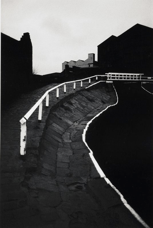
Lines: This is one of my favorite pieces of Kenna. The stark white lines are not only the main subjects but they also act as a guide for eye movement across the photo. In addition, the lines act as dividers for the tonal range of the photo - middle grey is contained by the two white lines in the center of the photo and black is on the outside of the lines. I find this shot incredibly impressive and creative since it's difficult to envision this type of final result when I'm just looking through the viewfinder.
Contrast: The contrast in this photo is consistent with the rest of Kenna's work. What's interesting in this photo is Kenna's use of middle grey. Middle grey flows from the bottom center of the photo all the way to the top third of the photo, finally connecting the sky using the building in the distance. Kenna could've processed that grey building black (and I'm sure he tried it), but instead he chose to process it grey. With a grey tone, the building breaks up the black, allowing the grey from the bottom of the photo to flow freely into the sky, preventing the photo from feeling closed off.
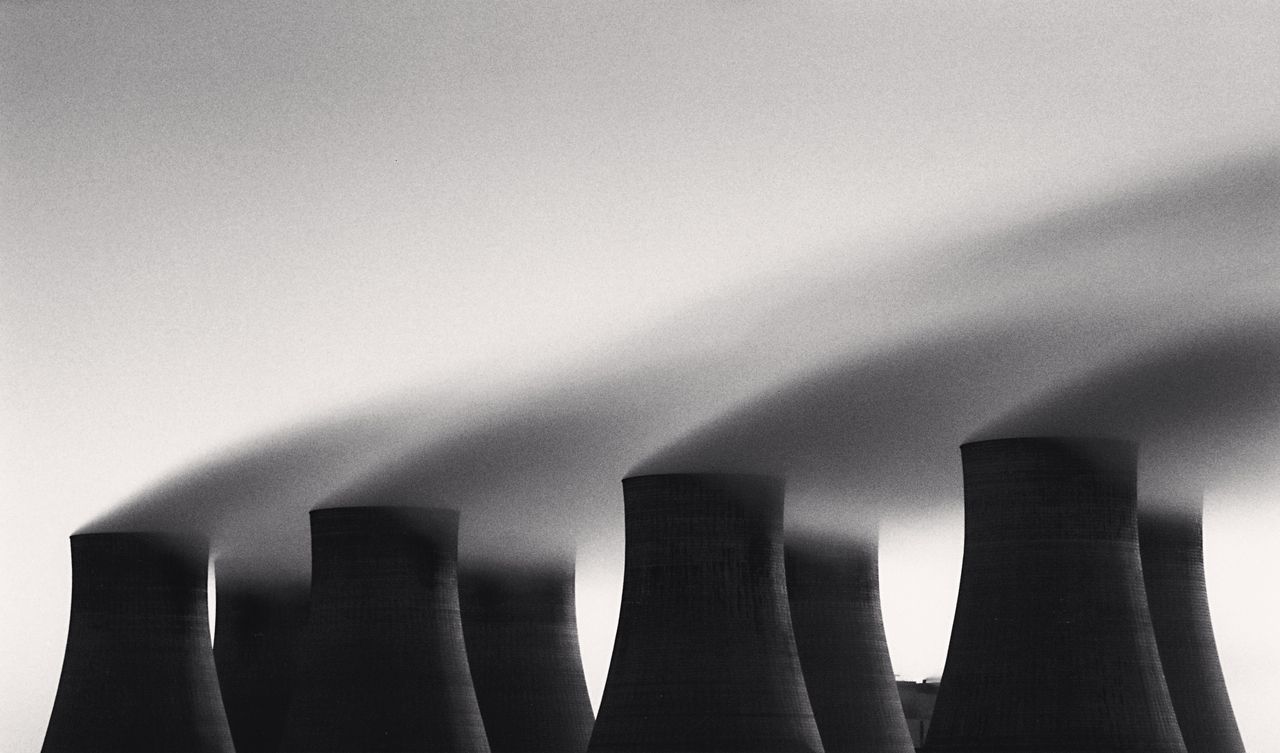
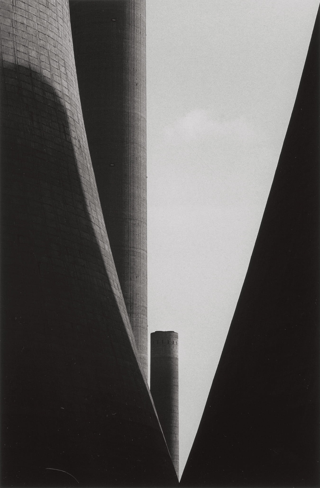
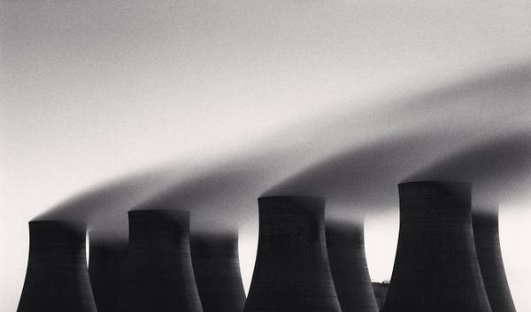
Study 6: Kenna's series on the Ratcliffe Power Station is one of my favorite of his. In the right photo, numerous triangles are formed by the cylindrical sloped towers, which are further accentuated by post-processing the shadows extra dark. The buildings are reduced to simple rigid shapes and it's difficult to recognize the buildings and estimate the scale. Tension is created by splitting the large triangle in the center by the two cylindrical buildings. As a result, the photo feels ominous, foreign, and somewhat intimidating.
Study 36: In the left photo, a pleasing rhythm is created with repetitive cylindrical towers. Due to the extremely long exposure and wind, the smoke starts to take shape in the form of a cone and becomes textureless, contributing to the overall rhythm. Thus, a beautiful juxtaposition is formed between the rigid and strong towers against the smooth and soft looking smoke, giving off a similar feeling of mystery and ominousness.
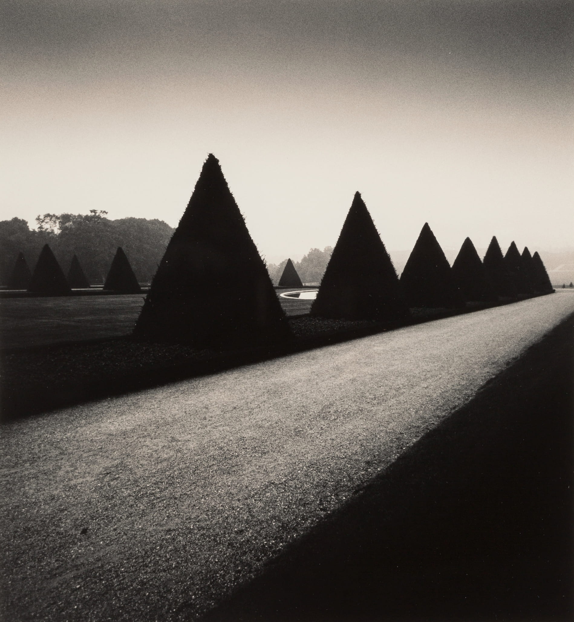
Left: In the "Homage to Atget" series, Kenna photographs numerous fixtures in the Parc de Sceaux, which all exhibit distinguishable shapes. In the left example, the primary focus is on the triangle hedges, supported by the leading line (or polygon) of the road. The textured and light road contrasts the textureless less and dark triangles, creating a pleasant feeling of balance (as you can probably tell, we can see a recurring pattern with how Kenna processes and handles contrast). There's also a little fuzz on the edge of the triangle hedges, which is a nice juxtaposition to the strong shape of the triangle. Rhythm is created through contrast from the bottom right corner to the top left corner (dark, light, dark, light, dark). It's also interesting to see that each of these regions start wide on the left side and converge to the right-center.
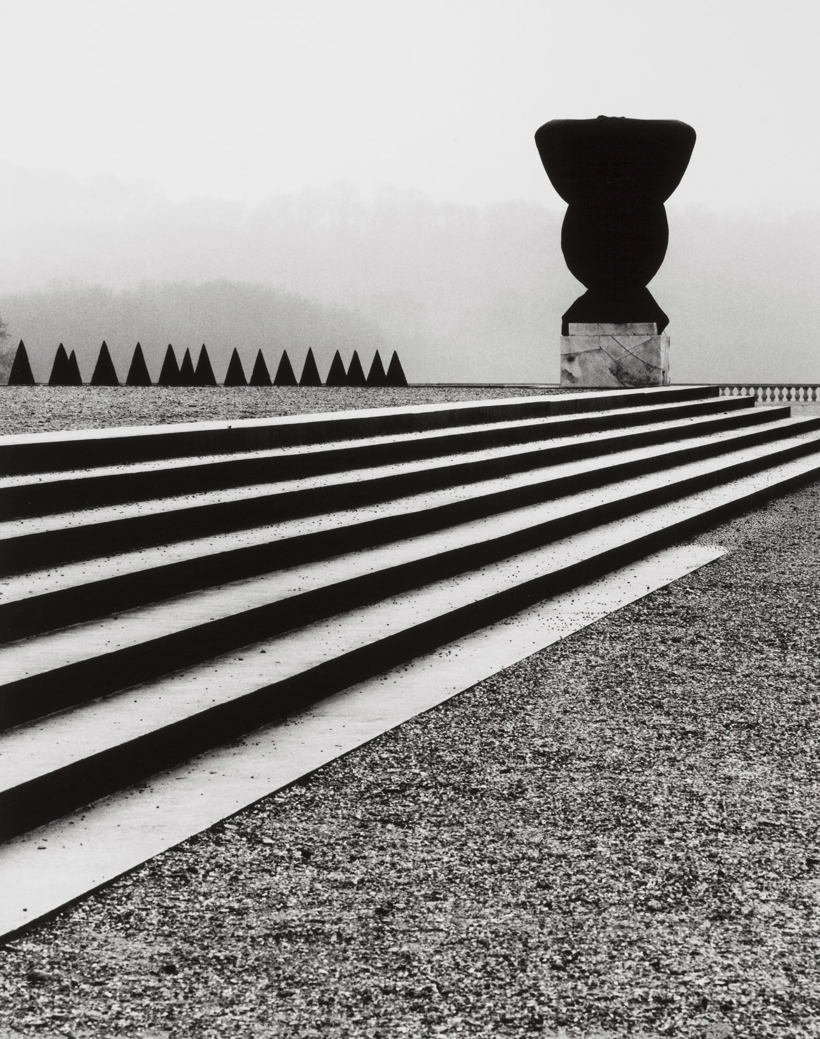
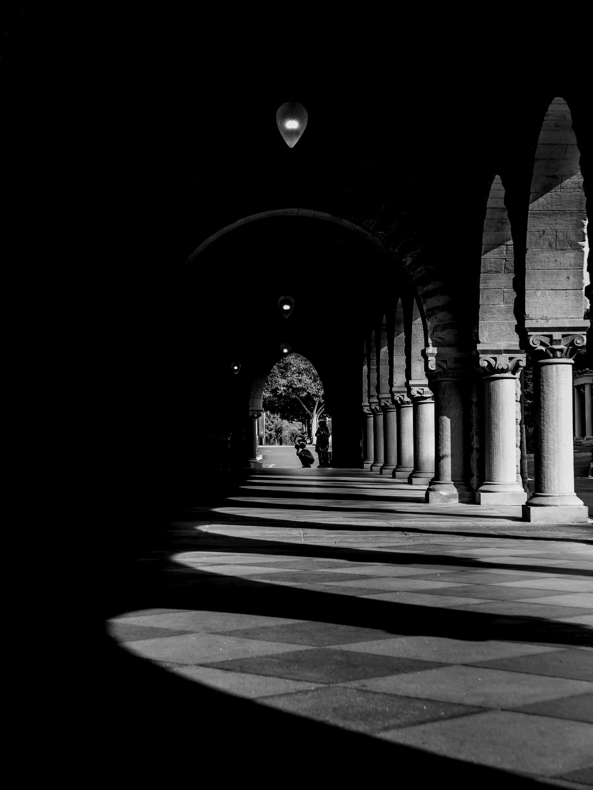
Right: The right piece uses similar techniques. However, in this one, the black sculpture (at least I think it's a sculpture) is the main focus of the photo, and everything else leads to the sculpture. The triangular hedges and the rectangular lines formed by the ledges intersect at the sculpture, creating a natural flow. All the detail is processed out such that the sculpture seems flat and the viewer can only focus on the bizarre shape of the sculpture. It's really hard to tell what the black subject is - it could be a black cover over a fixture, a freshly cut hedge, or really just a sculpture. But that's the beauty of it, the composition keeps you wondering and you really appreciate the shape.
Conclusion
I hope you find this post helpful in keeping you mindful of compositions! Apart from understanding the compositional techniques and elements, there are a few other key points we can take away from Michael Kenna:
- It's okay to be aggressive with post-processing
- Simplify the photos such that the subject is clear
- Process intentionally to strengthen the subjects and compositional elements
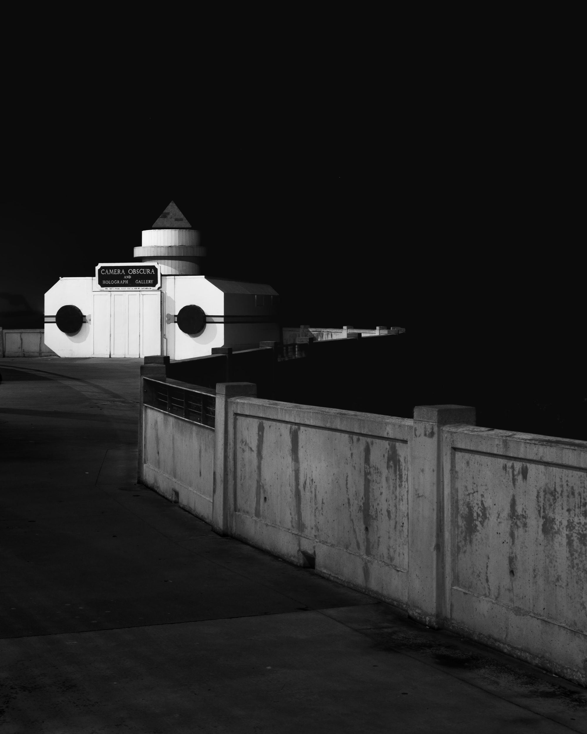
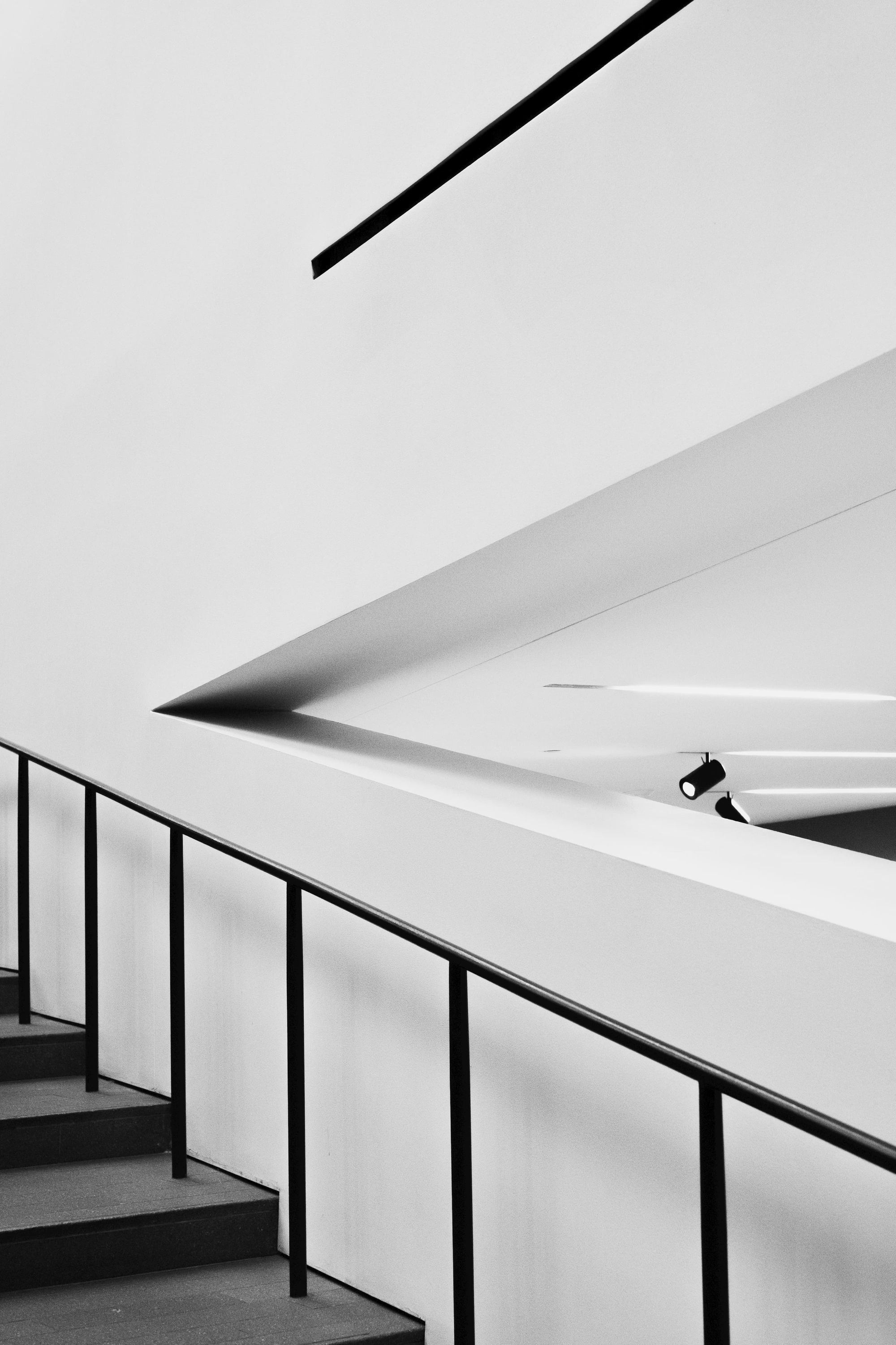
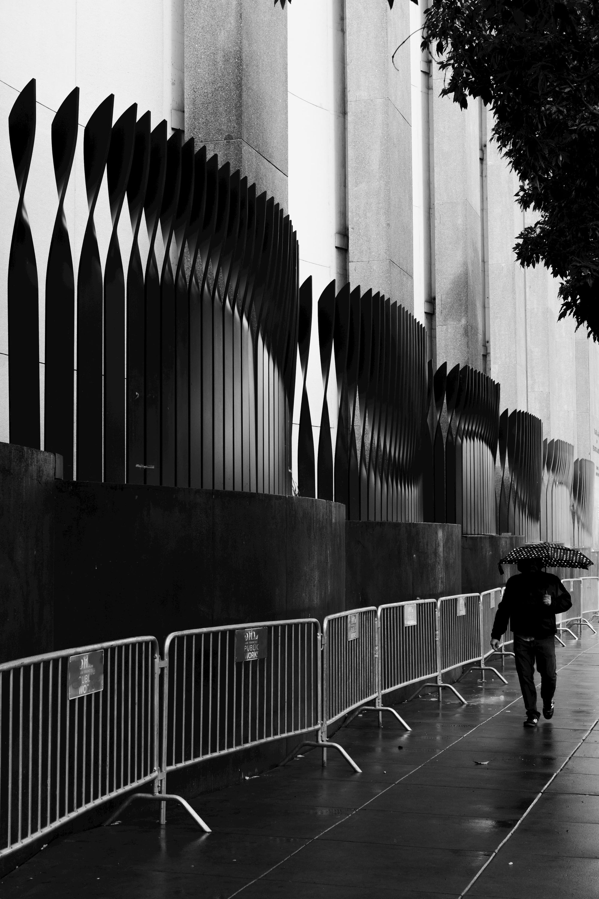
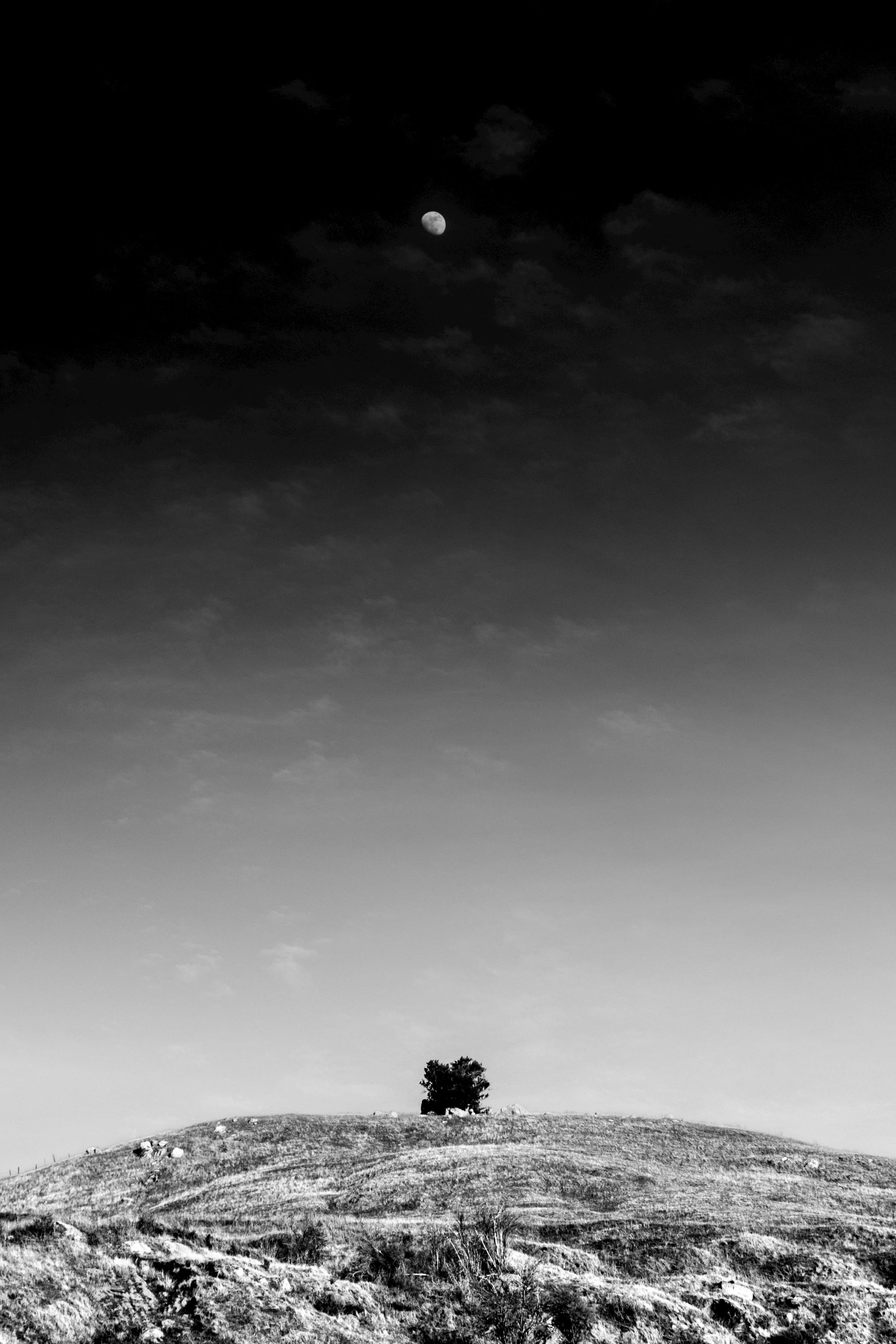
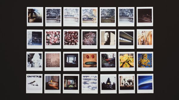
Of course, the only way to get better is through practicing with intention. I've included some of my attempts at incorporating these learnings into my photography. The photos are chronologically ordered with the most recent ones first. Please let me know what you think, feedback is always welcome!
If you're interested in more Michael Kenna analysis, there are two other videos on YouTube that I recommend watching - one by Photo Tom and the other by Ted Forbes.